
Or: pink doesn’t have to mean delicate
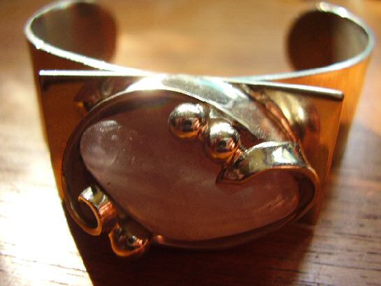
Rose quartz is a gentler stone than the labradorite and amethyst that dominate much of this collection, soft, translucent pink rather than dramatic colour-shift or saturated purple. Chromica’s Danish workshop paired it with the same structural, confidently minimal silverwork running through the rest of this collection’s Scandinavian pieces, proof that the mid-century Danish design language could handle a genuinely soft palette without losing its underlying discipline.
The bangle form itself is unforgiving in a way a pendant or brooch isn’t, it has to hold its shape and proportion from every angle, worn on a moving wrist rather than sitting still against fabric. Getting a large, softly coloured stone to feel structural rather than merely pretty in that format is a genuine design achievement, not a given.
Why softer stones are worth taking as seriously as dramatic ones. It would be easy to read restraint and quiet colour as a lesser design statement than labradorite’s dramatic flash or amethyst’s saturated purple. That undersells the actual difficulty: making a soft, low-contrast stone feel intentional and substantial, rather than simply muted, takes just as much design confidence as working with a more dramatic material.
What to look for. The rose quartz should show genuine, if subtle, translucency rather than being opaque or overly pale, and the Chromica mark should be clear. Both are present here.
This piece has since sold. It was part of a small, genuinely personal collection of mid-century jewellery, gathered over years rather than acquired for resale. See the Chromica rose quartz bangle on Gozotiques.