Erik Dennung: A Danish Maker Whose Range Is the Whole Point

Or: four pieces, four materials, one consistent hand

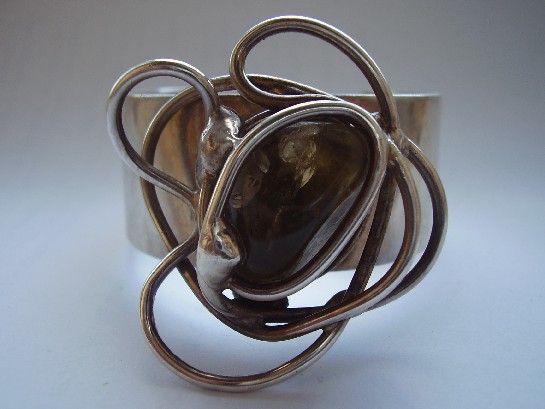
Erik Dennung’s work appears four times across this collection, and no two pieces share the same material or occasion. That range is itself the story worth telling: a designer confident enough in their own underlying structural logic to apply it to a genuine fossil, a retailer collaboration, classic pearl, and a purely functional adjustable ring, without any one of them reading as a compromise or an afterthought.

The fossil pendant is the boldest of the four, a genuine piece of geological history set in restrained silverwork that frames the fossil rather than competing with it, trusting the material to be interesting entirely on its own terms.

The pendant for Buch & Deichmann shows the commercial side of Danish mid-century design, a working designer producing pieces in direct collaboration with an established retail house, each lending the other credibility.

The silver and pearl bangle is the most conventionally elegant of the four, cleaner and more restrained than the fossil piece, proof that Dennung knew exactly when to let a material’s own lustre carry the design rather than asserting the silverwork over it.

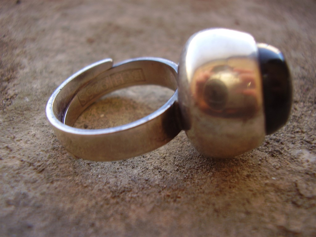
The adjustable ring solves the least glamorous problem of the four, fixed sizing, but does it by building the adjustment into the ring’s own structural form rather than bolting on an obvious mechanism, the same underlying design discipline applied to a purely functional constraint.

Why range matters as much as signature. It’s easy to identify a designer by one recognisable trick, the way Kauppi’s kinetic pieces get discussed elsewhere in this collection. Dennung is a different kind of case: no single gimmick ties his work together, just a consistent structural confidence that holds steady whatever the material or the brief. That’s arguably a harder thing for a maker to sustain, and a more interesting one to actually collect across.

Explore the individual pieces: the fossil pendant, the pendant for Buch & Deichmann, the silver and pearl bangle, and the adjustable ring.
Elis Kauppi and Kupittaan Kulta: One Finnish Goldsmith, Five Ways of Working

Or: what happens when you follow one maker through a whole collection instead of just one piece

Elis Kauppi founded Kupittaan Kulta in Turku, Finland, and became one of the defining names in Scandinavian modernist silver through the 1950s and 60s. His signature was kinetic construction, jewellery with parts that genuinely move, but reducing his work to that one trick undersells him. Five separate pieces by Kauppi have passed through this collection, spanning pendant, brooch, ring, and a substantial torque, and looking at them together tells a more complete story than any single piece can.

The kinetic amethyst pendant is Kauppi at his most experimental, a piece built around the Eye of Horus motif that genuinely moves as the wearer does, jewellery designed to be seen in motion rather than static repose.

The smoky quartz pendant shows the other side of that same design language: fixed rather than kinetic, but built from the same structural silverwork and the same instinct for letting a quiet stone carry the piece without competing for attention.

The tiger’s eye brooch takes the same chatoyant-stone logic that makes his kinetic pieces work, a stone that visibly shifts in the light, and applies it at brooch scale, in warm brown and gold rather than cool blue-green.

The silver ring is the hardest test of all: the same design language compressed down to finger scale, with almost no surface to work with, and it still reads unmistakably as his.

The silver and labradorite torque is the opposite extreme, an ancient neckpiece form rebuilt at real scale, letting labradorite’s shifting colour play move as dramatically as the design allows.

Why seeing all five together actually matters. A single Kauppi piece shows you a design. Five, across this range of scale and material, show you the underlying philosophy that produced all of them: metal and stone in genuine relationship, form that responds to the body rather than sitting inert on top of it. That’s a harder thing to fake than any single trick, and it’s consistent across every scale he worked at.

Explore the individual pieces: the kinetic amethyst pendant, the smoky quartz pendant, the tiger’s eye brooch, the silver ring, and the silver and labradorite torque.

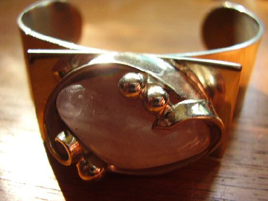
A Chromica Denmark Rose Quartz Bangle: Soft Colour, Structural Form

Or: pink doesn’t have to mean delicate

Chromica Denmark Rose Quartz Bangle

Rose quartz is a gentler stone than the labradorite and amethyst that dominate much of this collection, soft, translucent pink rather than dramatic colour-shift or saturated purple. Chromica’s Danish workshop paired it with the same structural, confidently minimal silverwork running through the rest of this collection’s Scandinavian pieces, proof that the mid-century Danish design language could handle a genuinely soft palette without losing its underlying discipline.

The bangle form itself is unforgiving in a way a pendant or brooch isn’t, it has to hold its shape and proportion from every angle, worn on a moving wrist rather than sitting still against fabric. Getting a large, softly coloured stone to feel structural rather than merely pretty in that format is a genuine design achievement, not a given.

Why softer stones are worth taking as seriously as dramatic ones. It would be easy to read restraint and quiet colour as a lesser design statement than labradorite’s dramatic flash or amethyst’s saturated purple. That undersells the actual difficulty: making a soft, low-contrast stone feel intentional and substantial, rather than simply muted, takes just as much design confidence as working with a more dramatic material.

What to look for. The rose quartz should show genuine, if subtle, translucency rather than being opaque or overly pale, and the Chromica mark should be clear. Both are present here.

This piece has since sold. It was part of a small, genuinely personal collection of mid-century jewellery, gathered over years rather than acquired for resale. See the Chromica rose quartz bangle on Gozotiques.

A Finland Modernist Silver and Labradorite Ring, 1974: Late-Stage Confidence

Or: what a design movement looks like once it’s stopped experimenting and started perfecting

Finland Modernist Silver and Labradorite Ring 1974

By 1974, Finnish modernist silver had nothing left to prove. The movement that Elis Kauppi and his contemporaries helped build through the 1950s and 60s had matured into a fully confident design language, and this ring, structural silverwork set with labradorite, shows exactly what that late-stage confidence looks like: no hesitation in the proportions, no uncertainty in how the stone is held, just a fully resolved design executed cleanly.

This piece sits usefully alongside the earlier Erik Granit bracelet in this collection, also dated, also Finnish, also 1970s, letting two independently made pieces from the same moment and movement effectively confirm each other. That kind of cross-reference is exactly how a private collection, built by someone paying real attention over years, ends up more useful to understand a design period than a single isolated purchase ever could.

Why the mid-1970s specifically matters for Finnish silver. This is arguably the design language at its peak maturity, after two decades of development but before the movement began fragmenting into more varied, less unified directions later in the decade. A dated 1974 piece is a genuine anchor point for understanding exactly where the movement stood at that moment.

What to look for. A clear date stamp alongside the maker’s mark, and labradorescence that shifts visibly in the light, both present and strong on this ring.

This piece is part of a small, genuinely personal collection of mid-century jewellery, gathered over years rather than acquired for resale. See the Finland Modernist ring on Gozotiques.

A Los Ballesteros Storyteller Bracelet, Circa 1950s: Mexico’s Silver Golden Age

Or: the workshop tradition that turned Taxco into a global silver capital

Los Ballesteros Storyteller Bracelet

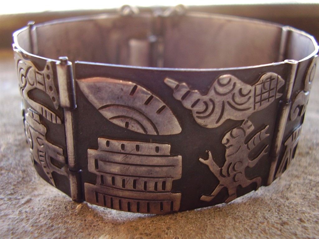
Los Ballesteros is part of the wider Taxco silver tradition, the Mexican town that became, almost by accident, one of the 20th century’s genuine centres of modernist silver design after William Spratling established his workshop there in the 1930s, training a generation of Mexican silversmiths who went on to found their own studios. This bracelet, in the storyteller style, narrative imagery worked directly into the silver’s surface, carries that lineage forward.

The storyteller form is distinct from the purely abstract modernist work elsewhere in this collection, figurative panels that read almost like a sequence, drawing on Mexican folk narrative traditions rather than European abstraction. It’s a genuinely different design language from the Scandinavian pieces in this collection while sharing the same underlying mid-century confidence in silver as a serious design medium.

Why Taxco’s story matters here. What happened in Taxco from the 1930s onward wasn’t one workshop’s success, it was the creation of an entire regional silver industry, dozens of workshops training under and then branching out from Spratling’s original studio. A piece like this represents that whole ecosystem, not an isolated maker working alone.

What to look for. The narrative panels should show crisp, legible detail, and the piece should carry both the maker’s mark and Mexican silver content stamps, standard for genuine Taxco-tradition work of this period. Both are present and clear here.

This piece is part of a small, genuinely personal collection of mid-century jewellery, gathered over years rather than acquired for resale. See the Los Ballesteros storyteller bracelet on Gozotiques.

A Rare Kurt Jobst Silver and Amber Bracelet: South Africa’s Modernist Silversmith

Or: the mid-century modernist story extends further than most people assume

Rare Kurt Jobst South Africa Silver and Amber Bracelet

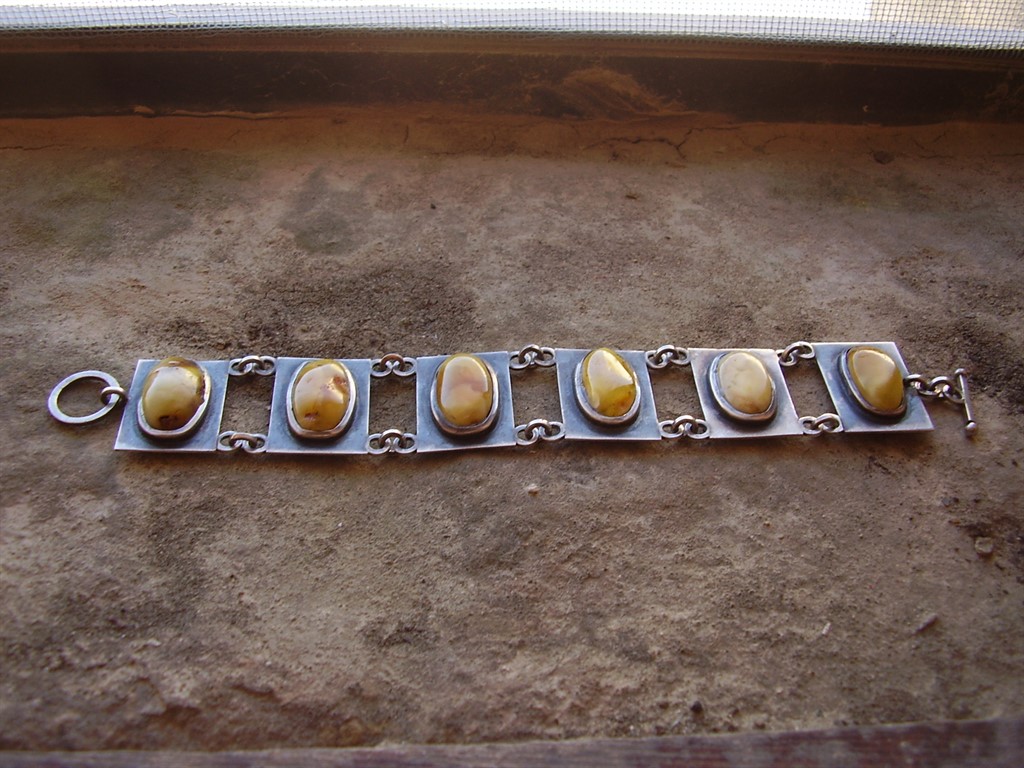
Kurt Jobst worked in South Africa through the mid-20th century, and pieces bearing his mark turn up far less often than the Scandinavian, Mexican, or American names that dominate most conversations about modernist silver. That rarity isn’t incidental to the piece, it reflects a genuinely smaller, less internationally distributed body of work than the workshops that supplied export markets across Europe and North America.

This bracelet, combining silver with amber, shows the same underlying modernist instinct running through this entire collection, structural form, honest material relationship, restraint over ornament, arrived at from yet another independent design tradition. Amber’s warm, translucent quality against structural silverwork gives this piece a genuinely different character from the cooler stones favoured further north.

Why rarity changes how you should think about a piece like this. A rare maker’s mark isn’t automatically more valuable than a famous one, but it is harder to verify against a body of comparable, well-documented work. That makes provenance and the mark’s own clarity more important here than with a Kupittaan Kulta or David Andersen piece, where decades of scholarship exist to lean on.

What to look for. A clear, legible Jobst mark alongside genuine amber, warm and slightly resinous rather than the harder, cooler feel of glass or plastic imitations, both present in this piece.

This piece is part of a small, genuinely personal collection of mid-century and antique jewellery, gathered over years rather than acquired for resale. See the Kurt Jobst bracelet on Gozotiques.

A Bengt Hallberg Swedesign Silver and Labradorite Ring: A Genuine Best Seller

Or: sometimes the popular piece really is the best-made one

Bengt Hallberg Sweden Swedesign Silver and Labradorite Ring

Bengt Hallberg’s Swedesign workshop produced some of the most consistently well-regarded Swedish silver of the mid-century period, and this ring, set with labradorite, shows exactly why: confident structural silverwork built to let the stone’s shifting colour play move as the hand does, the same design principle running through Elis Kauppi’s Finnish work elsewhere in this collection, arrived at independently by a Swedish maker working the same broad Scandinavian design language.

Labradorite rewards exactly this kind of setting, raised enough to catch the light from multiple angles as the wearer’s hand moves, rather than buried flat where the stone’s signature flash would barely register. Hallberg’s silverwork here does that job well, structural without being heavy, giving the stone room to actually perform.

Why ‘Swedesign’ as a workshop name is worth knowing. The name itself signals intent, a deliberate branding around Swedish design identity at a moment when Scandinavian design generally was becoming an internationally recognised category. Hallberg’s output under that name is well-documented and consistently well-made, which is part of why pieces like this one remain genuinely sought after.

What to look for. The labradorescence should shift visibly as the ring is turned, and the Swedesign mark should be clear and legible, both present and strong here.

This piece has since sold. It was part of a small, genuinely personal collection of mid-century and antique jewellery, gathered over years rather than acquired for resale. See the Bengt Hallberg ring on Gozotiques.

A Laurana Italy Enamel Bangle, 1960s: Italian Colour Meets Modernist Form

Or: Italy’s own take on the same design conversation the rest of Europe was having

Laurana Italy 1960's Enamel Bangle

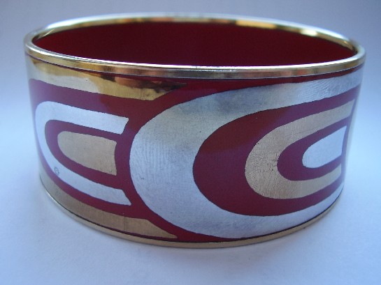
Italian mid-century design gets celebrated constantly in furniture and industrial design, Olivetti, the great postwar Milanese studios, but Italian jewellery from the same period gets talked about far less outside specialist circles. Laurana’s enamelled bangle is a useful corrective: the same postwar confidence in bold form and colour that defined Italian product design shows up here too, just applied to something worn on the wrist instead of sitting on a desk.

Where the Scandinavian pieces in this collection tend toward restraint and the natural colour of silver itself, this bangle leans into enamel’s saturated colour range, a distinctly Italian design instinct: form matters, but so does colour, and there’s no need to apologise for wanting both.

Why Italian mid-century jewellery deserves more attention than it gets. It sits in an odd gap: not old enough to be conventional antique jewellery, not famous enough as a design category to command the same collector interest as Italian furniture or glass from the same decades. That gap is exactly where genuinely good pieces can still be found without paying a premium purely for name recognition.

What to look for. The enamel should be glossy and fully intact with no hairline cracking, since enamelled pieces are always more fragile than plain metalwork, condition matters more here than with an equivalent silver-only piece.

This piece has since sold. It was part of a small, genuinely personal collection of mid-century and antique jewellery, gathered over years rather than acquired for resale. See the Laurana Italy enamel bangle on Gozotiques.

An Anette Borke Huge Agate Bangle: Denmark Working at Real Scale

Or: sometimes restraint means letting one enormous stone do all the talking

Anette Borke Denmark Huge Agate Bangle

Most of the mid-century Scandinavian silverwork in this collection makes its case through proportion and structure at a fairly modest scale. This bangle takes a different approach entirely: a genuinely large agate, banded in the mineral’s characteristic layered pattern, set as the whole point of the piece rather than one element among several. Anette Borke’s Danish workshop clearly understood that sometimes the most modernist decision available is simply to get out of the stone’s way.

Agate’s banding is entirely natural, no two stones cut the same way twice, which means a piece built around a stone this size is also, inevitably, a one-off. The silverwork here is confident enough to frame that scale without fighting it, structural rather than delicate, built to actually carry the visual weight of the stone rather than merely hold it in place.

Why scale itself is a design decision. A smaller stone in the same setting would read as a conventional bangle with a nice accent. At this size, the agate stops being decoration and becomes the actual subject, the same shift in thinking that separates a competent piece of jewellery from a genuinely confident one.

What to look for. The banding should show genuine natural variation and depth under light, rather than a flat, uniform colour that might suggest dyed or lower-grade material. This stone shows the real thing.

This piece has since sold. It was part of a small, genuinely personal collection of mid-century and antique jewellery, gathered over years rather than acquired for resale. See the Anette Borke agate bangle on Gozotiques.

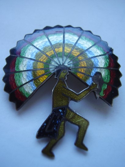
A Castelan Mexico Enamelled Brooch: Colour Enters the Modernist Story

Or: not every mid-century Mexican silver piece stayed within silver’s own colour range

Castelan Mexico enamelled brooch

Most of Mexico’s mid-century modernist silver, Los Ballesteros and Holzerco among the names elsewhere in this collection, worked within silver’s own tonal range, letting form and surface texture carry the design rather than colour. Castelan’s enamelled work takes a different route: bright, fired colour applied directly onto the silverwork, bringing genuine colour into a design tradition that mostly didn’t reach for it.

Enamelling is an unforgiving technique, glass-based colour fused to metal at high heat, prone to cracking or discolouring if the underlying craftsmanship isn’t precise. A well-preserved enamelled piece from this period is a genuine test of both the original maker’s skill and how carefully the piece has been kept since. This brooch passes both tests: clean, vivid colour with no visible cracking or wear to the enamel surface.

Why colour changes the collecting calculus. An enamelled piece is inherently more fragile than a purely silverwork one, which makes surviving examples in genuinely good condition more significant than their monochrome counterparts, not less. Condition does more of the work in determining real value here than it does with plain silver.

What to look for. Enamel should sit flush with the metal, glossy and unbroken, with no visible hairline cracks radiating from the edges, exactly the condition this piece is in.

This piece has since sold. It was part of a small, genuinely personal collection of mid-century and antique jewellery, gathered over years rather than acquired for resale. See the Castelan Mexico brooch on Gozotiques.