Elis Kauppi and Kupittaan Kulta: One Finnish Goldsmith, Five Ways of Working

Or: what happens when you follow one maker through a whole collection instead of just one piece

Elis Kauppi founded Kupittaan Kulta in Turku, Finland, and became one of the defining names in Scandinavian modernist silver through the 1950s and 60s. His signature was kinetic construction, jewellery with parts that genuinely move, but reducing his work to that one trick undersells him. Five separate pieces by Kauppi have passed through this collection, spanning pendant, brooch, ring, and a substantial torque, and looking at them together tells a more complete story than any single piece can.

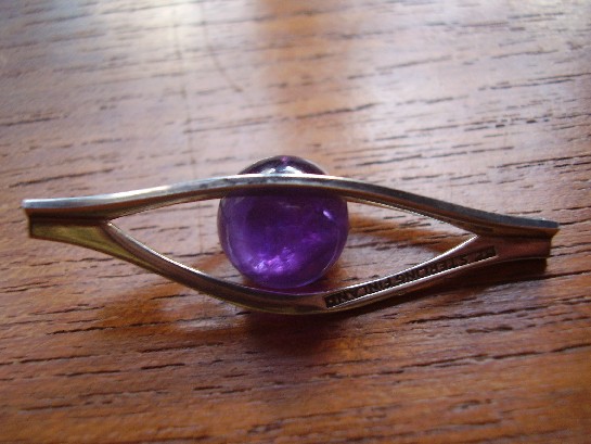
The kinetic amethyst pendant is Kauppi at his most experimental, a piece built around the Eye of Horus motif that genuinely moves as the wearer does, jewellery designed to be seen in motion rather than static repose.

The smoky quartz pendant shows the other side of that same design language: fixed rather than kinetic, but built from the same structural silverwork and the same instinct for letting a quiet stone carry the piece without competing for attention.

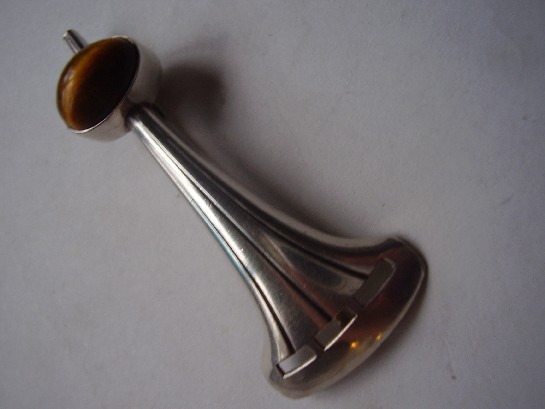
The tiger’s eye brooch takes the same chatoyant-stone logic that makes his kinetic pieces work, a stone that visibly shifts in the light, and applies it at brooch scale, in warm brown and gold rather than cool blue-green.

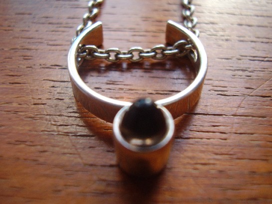
The silver ring is the hardest test of all: the same design language compressed down to finger scale, with almost no surface to work with, and it still reads unmistakably as his.

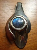
The silver and labradorite torque is the opposite extreme, an ancient neckpiece form rebuilt at real scale, letting labradorite’s shifting colour play move as dramatically as the design allows.

Why seeing all five together actually matters. A single Kauppi piece shows you a design. Five, across this range of scale and material, show you the underlying philosophy that produced all of them: metal and stone in genuine relationship, form that responds to the body rather than sitting inert on top of it. That’s a harder thing to fake than any single trick, and it’s consistent across every scale he worked at.

Explore the individual pieces: the kinetic amethyst pendant, the smoky quartz pendant, the tiger’s eye brooch, the silver ring, and the silver and labradorite torque.

A Finland Modernist Silver and Labradorite Ring, 1974: Late-Stage Confidence

Or: what a design movement looks like once it’s stopped experimenting and started perfecting

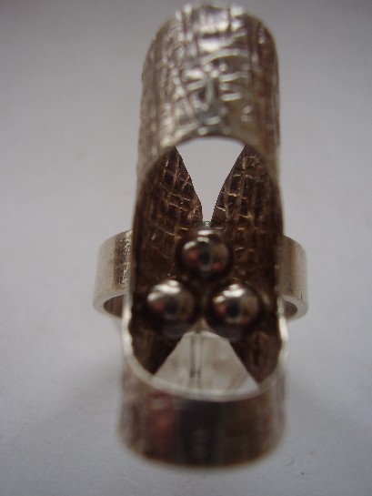
Finland Modernist Silver and Labradorite Ring 1974

By 1974, Finnish modernist silver had nothing left to prove. The movement that Elis Kauppi and his contemporaries helped build through the 1950s and 60s had matured into a fully confident design language, and this ring, structural silverwork set with labradorite, shows exactly what that late-stage confidence looks like: no hesitation in the proportions, no uncertainty in how the stone is held, just a fully resolved design executed cleanly.

This piece sits usefully alongside the earlier Erik Granit bracelet in this collection, also dated, also Finnish, also 1970s, letting two independently made pieces from the same moment and movement effectively confirm each other. That kind of cross-reference is exactly how a private collection, built by someone paying real attention over years, ends up more useful to understand a design period than a single isolated purchase ever could.

Why the mid-1970s specifically matters for Finnish silver. This is arguably the design language at its peak maturity, after two decades of development but before the movement began fragmenting into more varied, less unified directions later in the decade. A dated 1974 piece is a genuine anchor point for understanding exactly where the movement stood at that moment.

What to look for. A clear date stamp alongside the maker’s mark, and labradorescence that shifts visibly in the light, both present and strong on this ring.

This piece is part of a small, genuinely personal collection of mid-century jewellery, gathered over years rather than acquired for resale. See the Finland Modernist ring on Gozotiques.

An Elis Kauppi Silver Ring: The Same Hand, a Different Scale Again

Or: how a signature design language survives shrinking down to finger size

Elis Kauppi Kupittaan Kulta silver ring

Between the substantial silver and labradorite torque and this ring, this collection now holds Elis Kauppi’s work at three genuinely different scales, neckpiece, brooch, and finger, and the same design instincts hold across all of them. That’s a real test of a designer’s consistency: it’s one thing to have a signature look at a single scale, and another to keep the same structural logic legible when the object shrinks down to something worn on a single finger.

This ring shows the same restrained, structural silverwork as his larger pieces, just compressed. Nothing about it reads as a scaled-down version of a bigger idea, it’s a fully resolved design in its own right, which is exactly what separates a designer with a genuine underlying philosophy from one who just has a single recognisable trick.

Why rings are actually the hardest test of a design language. A ring has almost no surface to work with compared to a pendant or brooch, and it has to survive constant handling and wear in a way a brooch doesn’t. Getting a signature style to still read clearly at that scale, while staying genuinely wearable day to day, is a harder design problem than it looks.

What to look for. The Kupittaan Kulta and Kauppi marks should both be legible despite the ring’s small surface area, a genuine test of whether a piece has been worn hard enough to blur its own maker’s mark. This one is still clearly stamped.

This piece has since sold. It was part of a small, genuinely personal collection of mid-century and antique jewellery, gathered over years rather than acquired for resale. See the Elis Kauppi ring on Gozotiques.

A Kupittaan Kulta Tiger’s Eye Brooch: Elis Kauppi Working in Brown and Gold

Or: the stone that looks like it’s lit from inside

Kupittaan Kulta Elis Kauppi silver and tiger's eye brooch

Tiger’s eye is a chatoyant stone, meaning it shows a moving band of light across its surface as it turns, the same optical effect, on a warmer palette, that makes labradorite so prized in the Kauppi torque elsewhere in this collection. Where that piece used labradorite’s cool blue-green flash, this brooch works in tiger’s eye’s warm brown and gold, a genuinely different mood from the same underlying design instinct: let the stone’s own optical behaviour do the visual work, and build the silver setting to support that rather than compete with it.

It’s a smaller, quieter piece than the torque, a brooch rather than a statement neckpiece, but it carries exactly the same design DNA. Seeing Kauppi apply the same underlying philosophy across such a different scale and stone is a genuinely useful way to understand what actually made his work consistent: not a single signature look, but a consistent way of thinking about the relationship between metal and stone.

Why tiger’s eye specifically suited this design language. The stone’s chatoyancy depends on the cut catching the light at the right angle, which meant Kauppi’s structural, often slightly raised settings weren’t just aesthetic choices, they genuinely served the stone’s optical properties, tilting it toward the light rather than burying it flat.

What to look for. The chatoyant band should move visibly as the brooch is tilted, a static-looking stripe suggests a lower-grade stone or a poor cut. This one shows the effect clearly.

This piece has since sold. It was part of a small, genuinely personal collection of mid-century and antique jewellery, gathered over years rather than acquired for resale. See the Kupittaan Kulta Tiger’s Eye brooch on Gozotiques.

A Kupittaan Kulta Smoky Quartz Pendant: Elis Kauppi Without the Kinetics

Or: what his design language looks like when it holds still

Kupittaan Kulta Elis Kauppi smoky quartz silver pendant

Elis Kauppi is best known, at least in this collection, for kinetic pieces, jewellery built with parts that genuinely move. This smoky quartz pendant shows the other side of his design language: fixed, structural, but still unmistakably his, the same confident, sculptural silverwork built around the stone rather than simply holding it in place. It’s a useful reminder that a designer’s signature isn’t just their showiest trick, it’s the underlying design logic that holds even when the trick isn’t present.

Smoky quartz was a favoured stone across Scandinavian mid-century jewellery generally, warm, subtle, and far less showy than amethyst or labradorite, which suited the movement’s broader preference for restraint over spectacle. Kauppi’s setting here lets the stone’s quiet colour do the work rather than competing with an elaborate mount.

Why this piece is worth having alongside his kinetic work. Seeing a designer’s static pieces next to their more experimental ones tells you more about their actual design instincts than either alone. The same structural confidence, the same relationship between metal and stone, runs through both, kinetics turn out to be an expression of that underlying language, not a separate trick layered on top of it.

What to look for. Genuine smoky quartz shows real depth and slight variation in its brown-grey tone under different light, a flat, uniformly dark stone is worth a second look. This one shows the real thing.

This piece has since sold. It was part of a small, genuinely personal collection of mid-century and antique jewellery, gathered over years rather than acquired for resale. See the Kupittaan Kulta smoky quartz pendant on Gozotiques.

An Erik Granit Silver Bracelet, 1972: Finnish Craft at Its Peak Decade

Or: why the early 1970s might be the single best-documented moment in Finnish silver design

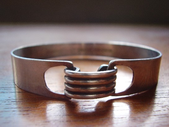
Erik Granit Finland silver bracelet 1972

By 1972, when this bracelet was made, Finnish silver design had spent a solid two decades building the reputation that still defines it today. The Kupittaan Kulta workshops, Kalevala Koru, and independent makers like Erik Granit were all working from a shared, matured design vocabulary, structural silverwork, honest surfaces, forms that owed more to sculpture than to traditional ornament. This bracelet is a confident, fully realised example of exactly that moment.

A dated piece like this one is genuinely useful to a collector in a way an undated piece isn’t. Knowing it’s 1972 rather than a vague ‘mid-century’ places it precisely at the point where Finnish modernist silver had moved past its early experimental phase and into full maturity, the design confidence of a movement that knows exactly what it’s doing, not still working out what it wants to be.

Why independent makers matter alongside the famous workshops. Kupittaan Kulta gets most of the attention in any account of this period, deservedly, but the wider strength of Finnish design in the 1960s and 70s came from a genuinely broad base of makers working to a shared standard, not one workshop carrying the whole movement. Granit is part of that wider foundation.

What to look for. A clear date mark alongside the maker’s stamp, exactly as this piece has, is worth more to a collector than an undated piece from a more famous name, precision beats prestige when you’re actually trying to understand a design movement rather than just collect a signature.

This piece has since sold. It was part of a small, genuinely personal collection of mid-century and antique jewellery, gathered over years rather than acquired for resale. See the Erik Granit bracelet on Gozotiques.

An Aarikka Turned Wood Pendant: Finland’s Other Design Tradition

Or: not every Finnish design story is told in silver

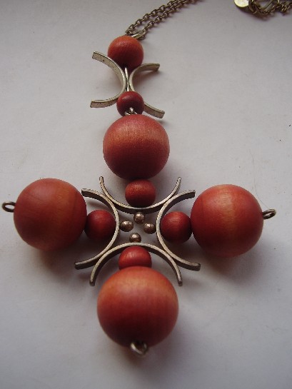
Aarikka Finland 1960s turned wood pendant

Finland’s mid-century design reputation is easy to tell entirely through metalwork, Kupittaan Kulta, Kalevala Koru, the silver houses that dominate any conversation about Scandinavian jewellery. Aarikka told a different, equally Finnish story, founded in 1962 by Kaija Aarikka, working almost entirely in turned wood rather than precious metal.

This pendant is a good example of why that mattered. Wood was cheap, domestic, and unmistakably Finnish, birch and other native timbers were the actual material of everyday Finnish life in a way imported silver never quite was. Aarikka’s turned, simplified forms, this pendant’s smooth, rounded geometry among them, took that humble material and gave it exactly the same design seriousness the silver houses were applying to precious metal.

Why this matters for how the whole movement gets remembered. Scandinavian mid-century design gets summarised, often, as a story about wealth and precious materials handled with restraint. Aarikka is a useful corrective: the same design instincts, honest material, clean form, no unnecessary ornament, worked just as well applied to a piece of turned birch as to a bar of silver. The philosophy was the point, not the metal.

What to look for. The turning should be smooth and even, with the wood’s natural grain left visible rather than painted over, that respect for the material’s own character is the whole point of the design, and it’s intact here.

This piece has since sold. It was part of a small, genuinely personal collection of mid-century and antique jewellery, gathered over years rather than acquired for resale. See the Aarikka wood pendant on Gozotiques.

A Kupittaan Kulta Silver and Labradorite Torque: Elis Kauppi at His Most Ambitious

Or: what happens when a Finnish goldsmith stops making jewellery and starts making sculpture you can wear

Kupittaan Kulta silver and labradorite torque and pendant

A torque, structurally, is one of the oldest jewellery forms there is: a rigid, near-circular band worn around the neck, traceable back to Iron Age Europe. What makes this piece remarkable is what Elis Kauppi does with that ancient form. Rather than treating it as a simple hoop, he builds it as a substantial, sculptural silver structure set with labradorite, the stone that shows a shifting flash of blue and green depending on the angle of light, and turns a genuinely old idea into something that reads as pure 1960s Scandinavian modernism.

Why this is a step beyond his other work in this collection. Kauppi’s pendants and rings, several of which are elsewhere in this collection, show his kinetic and structural instincts at a relatively modest scale. A torque this substantial is a different proposition entirely, more silver, more engineering, more physical presence on the body. It’s the kind of piece a designer makes when they’ve fully mastered the smaller forms and want to see how far the same ideas scale up.

Why labradorite, specifically. The stone’s shifting colour play, known as labradorescence, rewards exactly the kind of bold, structural setting Kauppi favoured. A small stone in a delicate setting would waste the effect; a substantial cabochon set into serious silverwork lets the colour genuinely move as the wearer does, which ties directly back to Kauppi’s broader interest in jewellery that responds to motion rather than sitting inert.

What to look for. The labradorescence should shift visibly as the piece is turned in the light, a flat, static-looking stone is a sign of a lower grade of material. This one shows the effect clearly.

This piece has since sold. It was part of a small, genuinely personal collection of mid-century and antique jewellery, gathered over years rather than acquired for resale. See the Kupittaan Kulta torque on Gozotiques.

Elis Kauppi’s Kinetic Amethyst Pendant: Finnish Modernism That Actually Moves

Or: the Finnish goldsmith who put jewellery in motion

Kupittaan Kulta Elis Kauppi Kinetic Amethyst Eye of Horus Pendant

Most jewellery sits still. Elis Kauppi’s didn’t. Founder of Kupittaan Kulta in Turku, Finland, Kauppi became one of the defining names in Scandinavian modernist silverwork through the 1950s and 60s, and one of his signatures was kinetic construction, pieces with parts that genuinely swing, rotate, or shift as the wearer moves, rather than sitting as fixed ornament.

This pendant, worked around an amethyst cabochon, carries that same restless quality. Scandinavian modernism of this period was reacting hard against ornate, traditional goldsmithing, favouring clean structural forms and a real relationship between metal and stone rather than the stone simply being mounted onto it. Kauppi’s kinetic pieces push that a step further: the design isn’t finished until someone is actually wearing it.

Why Finland, specifically. Finnish silver design in this era had real international standing, part of the broader Scandinavian design wave that shaped how the whole world thought about modern jewellery, alongside Georg Jensen in Denmark and a handful of other studios. Kupittaan Kulta pieces from this period are genuinely collected, not just old stock.

What makes this one worth having. Kinetic elements are also the first thing to fail on a worn or poorly maintained piece, so a mechanism that still moves smoothly after this many decades says something real about how it’s been kept. This one still does exactly what Kauppi built it to do.

This piece has since sold. It was part of a small, genuinely personal collection of mid-century and antique jewellery, gathered over years rather than acquired for resale. See the Kupittaan Kulta pendant on Gozotiques.