
Or: the stone that looks like it’s lit from inside
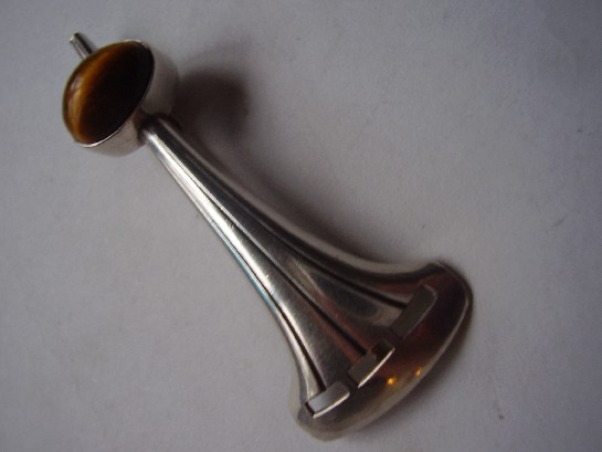
Tiger’s eye is a chatoyant stone, meaning it shows a moving band of light across its surface as it turns, the same optical effect, on a warmer palette, that makes labradorite so prized in the Kauppi torque elsewhere in this collection. Where that piece used labradorite’s cool blue-green flash, this brooch works in tiger’s eye’s warm brown and gold, a genuinely different mood from the same underlying design instinct: let the stone’s own optical behaviour do the visual work, and build the silver setting to support that rather than compete with it.
It’s a smaller, quieter piece than the torque, a brooch rather than a statement neckpiece, but it carries exactly the same design DNA. Seeing Kauppi apply the same underlying philosophy across such a different scale and stone is a genuinely useful way to understand what actually made his work consistent: not a single signature look, but a consistent way of thinking about the relationship between metal and stone.
Why tiger’s eye specifically suited this design language. The stone’s chatoyancy depends on the cut catching the light at the right angle, which meant Kauppi’s structural, often slightly raised settings weren’t just aesthetic choices, they genuinely served the stone’s optical properties, tilting it toward the light rather than burying it flat.
What to look for. The chatoyant band should move visibly as the brooch is tilted, a static-looking stripe suggests a lower-grade stone or a poor cut. This one shows the effect clearly.
This piece has since sold. It was part of a small, genuinely personal collection of mid-century and antique jewellery, gathered over years rather than acquired for resale. See the Kupittaan Kulta Tiger’s Eye brooch on Gozotiques.