An Erik Dennung Silver and Pearl Bangle, Circa 1960s: Denmark’s Consistent Hand

Or: three pieces by the same maker, three different reasons to trust him

Erik Dennung’s work now appears three times in this collection, a fossil pendant, a piece made in collaboration with Buch & Deichmann, and this bangle, pairing silver with pearl. Seeing the same maker’s hand across genuinely different materials and forms, geological fossil, collaborative retail piece, and now a classic pearl setting, says more about his actual range than any single piece could on its own.

Pearl is a softer, more conventionally elegant choice than the fossil or the structural stones elsewhere in this collection, and Dennung’s silverwork here adapts accordingly: cleaner, more restrained settings that let the pearl’s natural lustre carry the piece, rather than the bolder structural framing his fossil pendant uses. That range, knowing when to assert the silverwork and when to recede behind the material, is a real mark of a mature designer.

Why owning multiple pieces by one maker changes how you see them. A single Dennung piece is just a well-made object. Three, spanning different materials and moods, becomes something closer to a small survey of one designer’s actual range, exactly the kind of pattern that only emerges from a collection built by someone paying real attention over years rather than buying at random.

What to look for. The pearls should show genuine lustre and be free of significant surface pitting, and the Dennung mark should match the style seen on his other pieces here. Both check out on this bangle.

This piece is part of a small, genuinely personal collection of mid-century jewellery, gathered over years rather than acquired for resale. See the Erik Dennung pearl bangle on Gozotiques.

[Image pending, to be added once source photo is confirmed.]
A Gebrüder Falk Art Nouveau Silver and Ruby Lizard Brooch: The Movement’s Favourite Reptile

Or: why lizards turn up constantly in Art Nouveau jewellery once you start looking

Alongside the insects, dragonflies especially, that define so much Art Nouveau jewellery, the lizard was another recurring subject the movement kept returning to. Its sinuous, curving body suited the era’s obsession with organic, flowing line better than almost any other creature available, a single lizard’s form could carry the whole visual vocabulary of the style in one continuous shape. This brooch, by the German house Gebrüder Falk, set with ruby accents, is a strong example of exactly that.

Gebrüder Falk, working in the same broad German Art Nouveau tradition as the guard chain elsewhere in this collection, brings the same combination this collection keeps returning to: precious material, silver and genuine ruby, handled with the movement’s naturalist sensibility rather than traditional formal jewellery’s more rigid symmetry. The lizard’s form curves and flows the way the era’s poster art and glasswork did too, the same visual language across entirely different media.

Why the lizard motif specifically rewarded a skilled silversmith. Unlike a symmetrical floral motif, a convincing lizard has to read correctly from every angle while still following the body’s actual anatomy, no cheating the proportions to make the metalwork easier. Getting both the naturalism and the flowing Art Nouveau line right simultaneously took real skill.

What to look for. The ruby settings should be secure and the silverwork’s line should read as a genuine, anatomically plausible lizard rather than an abstracted squiggle, both true of this piece.

This piece is part of a small, genuinely personal collection of antique jewellery, gathered over years rather than acquired for resale. See the Gebrüder Falk lizard brooch on Gozotiques.

[Image pending, to be added once source photo is confirmed.]
An Austrian Cold-Painted Bronze Cat: The Vienna Bronze Tradition

Or: the animal bronzes that made Vienna famous for something other than music

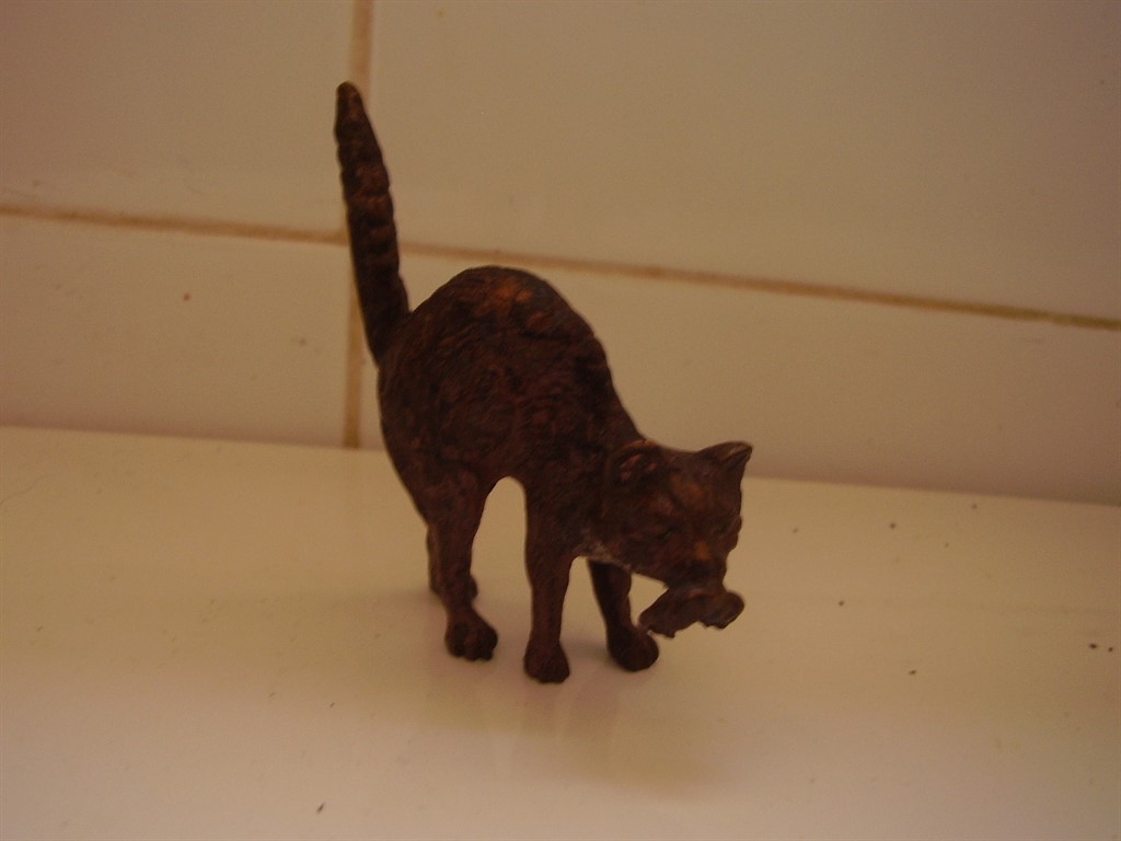
Austrian Cold-Painted Bronze Cat

Vienna’s cold-painted bronze tradition, sometimes called Austrian bronzes, flourished from the mid-19th century onward, small cast animal figures finished with hand-applied cold enamel paint rather than fired glaze, giving them a level of realistic colour detail that traditional patinated bronze couldn’t achieve. This piece, a cat with a mouse or rat caught in its jaws, stamped BERGM, sits squarely in that tradition: a small, sharply observed moment of animal behaviour rendered with real technical skill.

‘Cold-painted’ refers specifically to the technique, paint applied after casting and cooling, rather than any glaze fired onto the metal. This let Viennese workshops achieve genuinely naturalistic colouring, fur texture, eye detail, the specific tones of a real animal, in a way that plain patinated bronze simply couldn’t match. It’s a more fragile technique than it looks, the paint can wear or chip over a century of handling.

Why the subject matter matters. Vienna bronze workshops covered everything from birds to elephants, but predator-and-prey moments like this one were a genuine specialty, small, sharply observed slices of nature rather than generic decorative animals. Getting the anatomy and the moment convincing was the entire point.

What to look for. The cold paint should retain real colour and detail rather than being worn to bare bronze, and the BERGM stamp should be clearly legible, both hold up well on this piece.

This piece is part of a small, genuinely personal collection of antiques, gathered over years rather than acquired for resale. See the Austrian bronze cat on Gozotiques.

A Dresden Lattice Work Dish: Porcelain’s Most Demanding Technique

Or: the decoration that has to be right the first time, every time

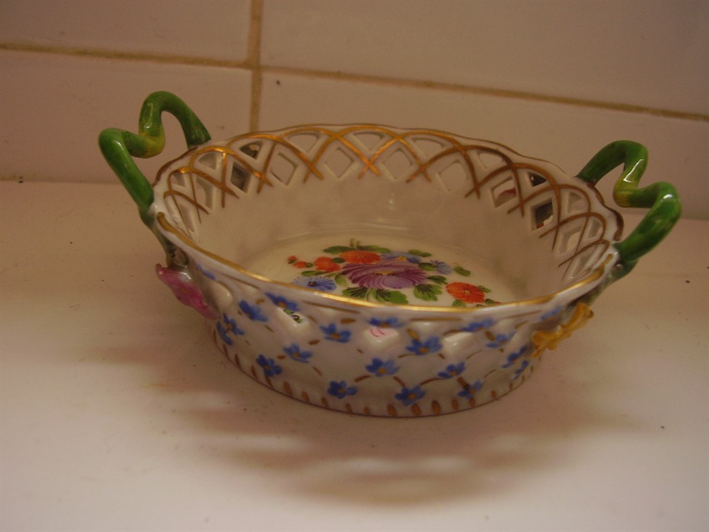
Dresden Lattice Work Dish

Lattice work, sometimes called reticulated porcelain, is one of the genuinely hardest techniques in ceramic decoration: the piece is pierced through in a repeating pattern before firing, meaning a single misjudged cut or an uneven kiln temperature can destroy hours of work in an instant. This small dish, with its green handles, gilding, and applied flowers and forget-me-nots, represents exactly that combination of technical risk and decorative confidence that Dresden porcelain built its reputation on.

Dresden, alongside nearby Meissen, became one of the defining names in European porcelain from the 18th century onward, and pieces like this, combining pierced latticework with hand-applied floral decoration and gilt detailing, represent the tradition at its most technically ambitious. Every element here, the lattice, the applied flowers, the gilding, had to survive the same firing without a single failure.

Why this piece is a genuine outlier in this collection. Almost everything else here is metalwork, silver, bronze, copper. Porcelain survives by an entirely different logic, it can’t be reshaped or repaired the way metal can, which makes a piece this delicate surviving intact, with its pierced lattice unbroken, a meaningfully rarer thing than an equivalent silver piece surviving the same span of time.

What to look for. Every pierced opening in the lattice should be intact with no hairline cracks radiating from the cuts, the single most common failure point on pieces like this. This dish’s lattice is fully sound.

This piece is part of a small, genuinely personal collection of antiques, gathered over years rather than acquired for resale. See the Dresden lattice dish on Gozotiques.

A Finland Modernist Silver and Labradorite Ring, 1974: Late-Stage Confidence

Or: what a design movement looks like once it’s stopped experimenting and started perfecting

Finland Modernist Silver and Labradorite Ring 1974

By 1974, Finnish modernist silver had nothing left to prove. The movement that Elis Kauppi and his contemporaries helped build through the 1950s and 60s had matured into a fully confident design language, and this ring, structural silverwork set with labradorite, shows exactly what that late-stage confidence looks like: no hesitation in the proportions, no uncertainty in how the stone is held, just a fully resolved design executed cleanly.

This piece sits usefully alongside the earlier Erik Granit bracelet in this collection, also dated, also Finnish, also 1970s, letting two independently made pieces from the same moment and movement effectively confirm each other. That kind of cross-reference is exactly how a private collection, built by someone paying real attention over years, ends up more useful to understand a design period than a single isolated purchase ever could.

Why the mid-1970s specifically matters for Finnish silver. This is arguably the design language at its peak maturity, after two decades of development but before the movement began fragmenting into more varied, less unified directions later in the decade. A dated 1974 piece is a genuine anchor point for understanding exactly where the movement stood at that moment.

What to look for. A clear date stamp alongside the maker’s mark, and labradorescence that shifts visibly in the light, both present and strong on this ring.

This piece is part of a small, genuinely personal collection of mid-century jewellery, gathered over years rather than acquired for resale. See the Finland Modernist ring on Gozotiques.

A Los Ballesteros Storyteller Bracelet, Circa 1950s: Mexico’s Silver Golden Age

Or: the workshop tradition that turned Taxco into a global silver capital

Los Ballesteros Storyteller Bracelet

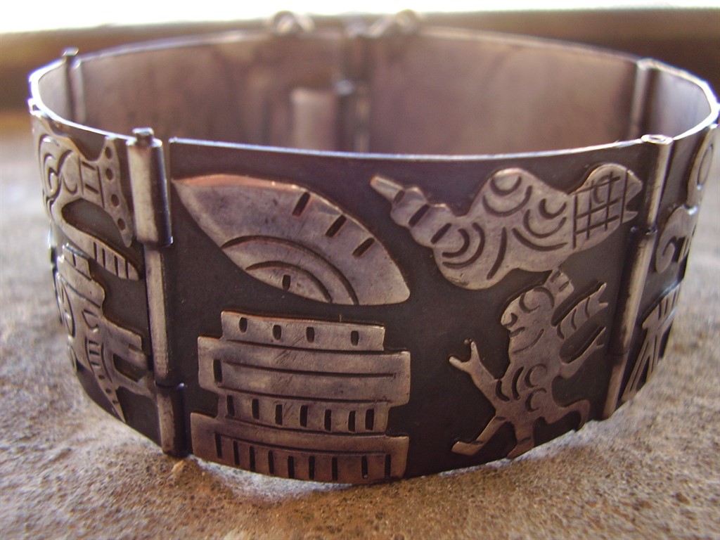
Los Ballesteros is part of the wider Taxco silver tradition, the Mexican town that became, almost by accident, one of the 20th century’s genuine centres of modernist silver design after William Spratling established his workshop there in the 1930s, training a generation of Mexican silversmiths who went on to found their own studios. This bracelet, in the storyteller style, narrative imagery worked directly into the silver’s surface, carries that lineage forward.

The storyteller form is distinct from the purely abstract modernist work elsewhere in this collection, figurative panels that read almost like a sequence, drawing on Mexican folk narrative traditions rather than European abstraction. It’s a genuinely different design language from the Scandinavian pieces in this collection while sharing the same underlying mid-century confidence in silver as a serious design medium.

Why Taxco’s story matters here. What happened in Taxco from the 1930s onward wasn’t one workshop’s success, it was the creation of an entire regional silver industry, dozens of workshops training under and then branching out from Spratling’s original studio. A piece like this represents that whole ecosystem, not an isolated maker working alone.

What to look for. The narrative panels should show crisp, legible detail, and the piece should carry both the maker’s mark and Mexican silver content stamps, standard for genuine Taxco-tradition work of this period. Both are present and clear here.

This piece is part of a small, genuinely personal collection of mid-century jewellery, gathered over years rather than acquired for resale. See the Los Ballesteros storyteller bracelet on Gozotiques.

A Swedish Silver Pendant of a Maiden in an Oak Tree, 1948: Folklore Set in Metal

Or: postwar Swedish design still had room for a fairy tale

Swedish Silver Pendant of Maiden in Oak Tree 1948

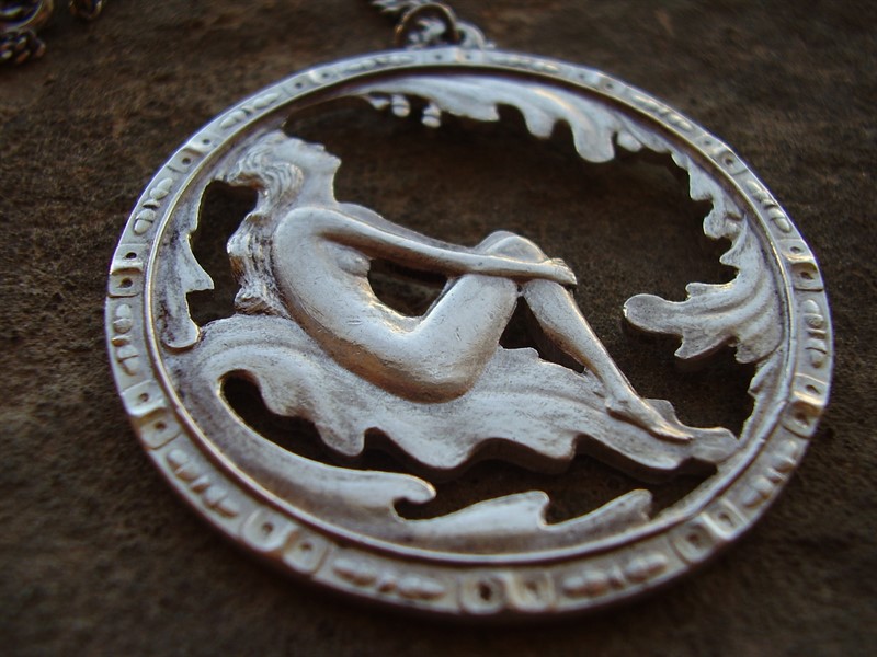
1948 sits right at the start of the clean, structural Scandinavian modernism that would come to define the region’s design reputation over the following two decades. This pendant is a useful reminder that the shift wasn’t instant or total: figurative, folkloric subjects, a maiden set within an oak tree, still had a real place in Swedish silverwork even as the wider design language was moving toward abstraction.

The maiden-in-a-tree motif draws on genuine Scandinavian folklore, tree spirits and forest maidens recur throughout Nordic legend, and rendering that subject in silver connects this piece to a much older craft tradition than the modernist silverwork elsewhere in this collection. It’s postwar in date but pre-modern in spirit, a bridge piece between two very different design instincts.

Why the date matters here specifically. A piece like this made a decade earlier would be unremarkable, folkloric silverwork was the norm. Made in 1948, right as Scandinavian modernism was beginning its ascent, it represents a genuine crossroads moment, craftsmanship looking backward toward legend even as the wider design culture around it was starting to look forward.

What to look for. The figurative detailing, the maiden’s form and the tree’s branches, should be crisp and legible rather than worn to a blur, and the 1948 date mark should be clearly struck. Both are intact on this piece.

This piece is part of a small, genuinely personal collection of antique jewellery, gathered over years rather than acquired for resale. See the Swedish maiden pendant on Gozotiques.

A French Art Nouveau Horn Fly Brooch by P. Lucas: Insects Were Never Beneath Art Nouveau

Or: the movement that found beauty in things most jewellers ignored

French Art Nouveau Horn Fly Brooch by P. Lucas

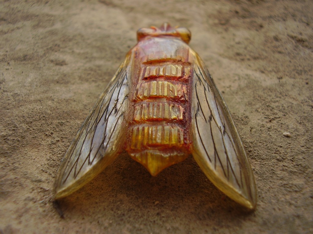
Art Nouveau’s obsession with insects, dragonflies, beetles, and here, a fly, wasn’t a novelty act. The movement’s core belief was that nature itself, studied closely rather than idealised, was the richest possible source of design, and insects offered structural and textural complexity that flowers alone couldn’t match. A fly is an odd choice by conventional Victorian standards, but entirely within Art Nouveau’s actual logic: study the form honestly, then render it beautifully.

Horn as a material matters here too. Carved and moulded horn became one of Art Nouveau’s signature materials specifically because it could be worked into translucent, organic forms that precious metal alone couldn’t achieve, closer in spirit to the material experimentation of Lalique’s glass work than to conventional jewellery-making. P. Lucas’s fly, rendered in horn, uses exactly that translucency to catch light the way an actual insect’s wings would.

Why an insect subject was a genuinely bold choice. Choosing a fly rather than a butterfly or dragonfly, both far more conventionally ‘pretty’ insect subjects, signals a maker genuinely committed to the movement’s naturalist philosophy rather than just borrowing its decorative vocabulary. This wasn’t the safe choice.

What to look for. The horn should show genuine natural translucency and grain rather than the uniform opacity of a later plastic imitation, and the maker’s mark should be clearly legible. Both hold up here.

This piece is part of a small, genuinely personal collection of antique jewellery, gathered over years rather than acquired for resale. See the French Art Nouveau horn fly brooch on Gozotiques.

A Silver and Enamel Suffragette Brooch, Circa 1900: Jewellery as Political Statement

Or: when wearing the wrong colour combination was itself a form of protest

Silver and Enamel Arts and Crafts Suffragette Brooch

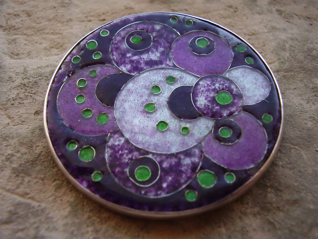
The Women’s Social and Political Union adopted purple, white, and green as its official colours in 1908, purple for dignity, white for purity, green for hope, and suffragette-sympathetic jewellers began producing pieces using exactly that palette almost immediately. This Arts and Crafts brooch, English, circa 1900, sits at the edge of that movement: silver and enamel work in the handmade, unpretentious style the Arts and Crafts movement favoured, a deliberate rejection of mass-produced Victorian jewellery in favour of visible, honest craftsmanship.

Arts and Crafts jewellery and the suffrage movement shared more than a historical moment, they shared an underlying philosophy: both were reactions against an establishment seen as ornamental, hollow, and resistant to genuine change. A woman choosing to wear a piece like this wasn’t just making an aesthetic choice, in the specific political climate of the period, it could be read as a visible, public statement.

Why this piece matters beyond its craftsmanship. Genuine suffrage-era jewellery is a real, if narrow, category of political and social history that happens to also be wearable. It sits at the intersection of design history and a specific, documented civil rights movement, which gives a piece like this a layer of significance that a purely decorative brooch from the same period wouldn’t carry.

What to look for. Hand-finished, slightly irregular enamel work and a visible hallmark consistent with the period, both present here, are what distinguish genuine Arts and Crafts pieces from later, more mechanically produced imitations of the style.

This piece is part of a small, genuinely personal collection of antique jewellery, gathered over years rather than acquired for resale. See the Suffragette brooch on Gozotiques.

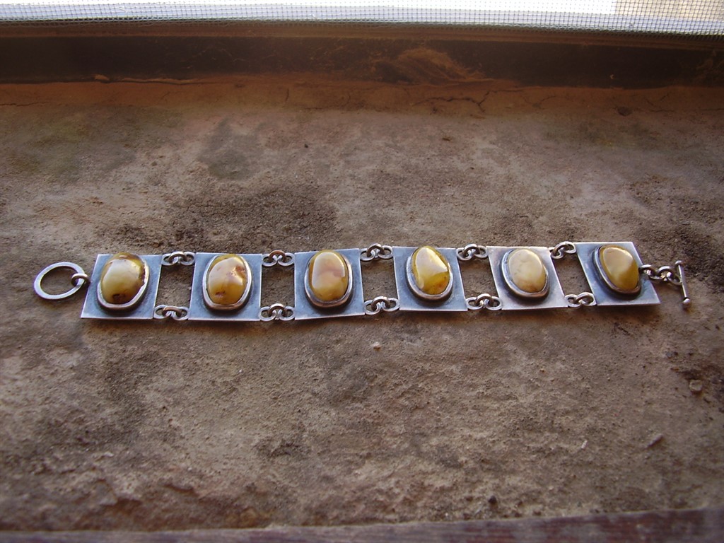
A Rare Kurt Jobst Silver and Amber Bracelet: South Africa’s Modernist Silversmith

Or: the mid-century modernist story extends further than most people assume

Rare Kurt Jobst South Africa Silver and Amber Bracelet

Kurt Jobst worked in South Africa through the mid-20th century, and pieces bearing his mark turn up far less often than the Scandinavian, Mexican, or American names that dominate most conversations about modernist silver. That rarity isn’t incidental to the piece, it reflects a genuinely smaller, less internationally distributed body of work than the workshops that supplied export markets across Europe and North America.

This bracelet, combining silver with amber, shows the same underlying modernist instinct running through this entire collection, structural form, honest material relationship, restraint over ornament, arrived at from yet another independent design tradition. Amber’s warm, translucent quality against structural silverwork gives this piece a genuinely different character from the cooler stones favoured further north.

Why rarity changes how you should think about a piece like this. A rare maker’s mark isn’t automatically more valuable than a famous one, but it is harder to verify against a body of comparable, well-documented work. That makes provenance and the mark’s own clarity more important here than with a Kupittaan Kulta or David Andersen piece, where decades of scholarship exist to lean on.

What to look for. A clear, legible Jobst mark alongside genuine amber, warm and slightly resinous rather than the harder, cooler feel of glass or plastic imitations, both present in this piece.

This piece is part of a small, genuinely personal collection of mid-century and antique jewellery, gathered over years rather than acquired for resale. See the Kurt Jobst bracelet on Gozotiques.