Erik Dennung: A Danish Maker Whose Range Is the Whole Point

Or: four pieces, four materials, one consistent hand

Erik Dennung’s work appears four times across this collection, and no two pieces share the same material or occasion. That range is itself the story worth telling: a designer confident enough in their own underlying structural logic to apply it to a genuine fossil, a retailer collaboration, classic pearl, and a purely functional adjustable ring, without any one of them reading as a compromise or an afterthought.

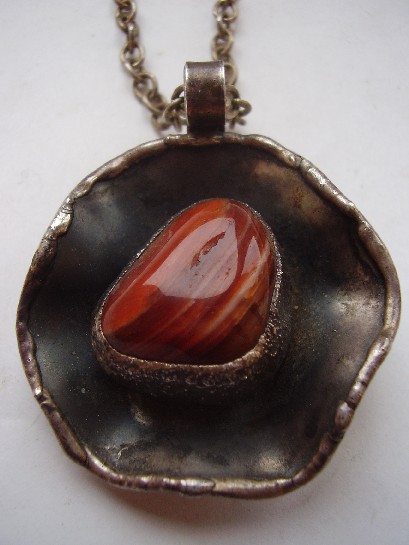
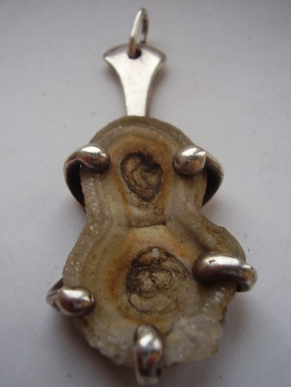
The fossil pendant is the boldest of the four, a genuine piece of geological history set in restrained silverwork that frames the fossil rather than competing with it, trusting the material to be interesting entirely on its own terms.

The pendant for Buch & Deichmann shows the commercial side of Danish mid-century design, a working designer producing pieces in direct collaboration with an established retail house, each lending the other credibility.

The silver and pearl bangle is the most conventionally elegant of the four, cleaner and more restrained than the fossil piece, proof that Dennung knew exactly when to let a material’s own lustre carry the design rather than asserting the silverwork over it.

The adjustable ring solves the least glamorous problem of the four, fixed sizing, but does it by building the adjustment into the ring’s own structural form rather than bolting on an obvious mechanism, the same underlying design discipline applied to a purely functional constraint.

Why range matters as much as signature. It’s easy to identify a designer by one recognisable trick, the way Kauppi’s kinetic pieces get discussed elsewhere in this collection. Dennung is a different kind of case: no single gimmick ties his work together, just a consistent structural confidence that holds steady whatever the material or the brief. That’s arguably a harder thing for a maker to sustain, and a more interesting one to actually collect across.

Explore the individual pieces: the fossil pendant, the pendant for Buch & Deichmann, the silver and pearl bangle, and the adjustable ring.
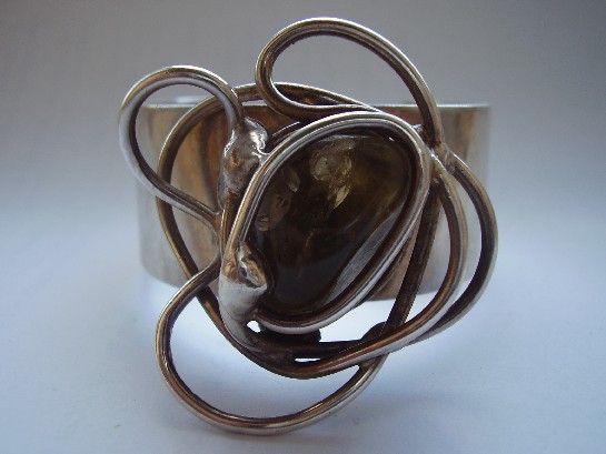
An Erik Dennung Silver Adjustable Ring, Circa 1960s: Function Built Into the Form

Or: a design problem most jewellers just ignore

An adjustable ring solves a real, practical problem, fixed sizing, but most solutions to that problem look like an afterthought, an obvious gap or crude mechanism bolted onto an otherwise finished design. Erik Dennung’s approach here integrates the adjustment into the ring’s actual structural form, consistent with the same design discipline running through his other two pieces in this collection: solve the practical problem without breaking the design’s own internal logic.

This is now the third Dennung piece in this collection, and the pattern holds again: whatever the material, whatever the practical constraint, the underlying structural confidence stays consistent. That’s a genuinely useful thing to be able to confirm across a fossil pendant, a pearl bangle, and now an adjustable ring, three different design problems, the same underlying hand solving all of them.

Why adjustable construction is harder than it looks. A ring has to survive real daily wear and repeated resizing without the mechanism loosening or the silver fatiguing at the adjustment point. Getting that engineering right while keeping the piece visually clean, with no visible strain or crude gap, is a genuine test of a silversmith’s structural understanding, not just their decorative sense.

What to look for. The adjustment point should move smoothly without visible metal fatigue or cracking, and the Dennung mark should be legible despite the ring’s small surface area. Both hold up on this piece.

This piece has since sold. It was part of a small, genuinely personal collection of mid-century jewellery, gathered over years rather than acquired for resale. See the Erik Dennung adjustable ring on Gozotiques.

[Image pending, to be added once source photo is confirmed.]

An Erik Dennung Silver and Pearl Bangle, Circa 1960s: Denmark’s Consistent Hand

Or: three pieces by the same maker, three different reasons to trust him

Erik Dennung’s work now appears three times in this collection, a fossil pendant, a piece made in collaboration with Buch & Deichmann, and this bangle, pairing silver with pearl. Seeing the same maker’s hand across genuinely different materials and forms, geological fossil, collaborative retail piece, and now a classic pearl setting, says more about his actual range than any single piece could on its own.

Pearl is a softer, more conventionally elegant choice than the fossil or the structural stones elsewhere in this collection, and Dennung’s silverwork here adapts accordingly: cleaner, more restrained settings that let the pearl’s natural lustre carry the piece, rather than the bolder structural framing his fossil pendant uses. That range, knowing when to assert the silverwork and when to recede behind the material, is a real mark of a mature designer.

Why owning multiple pieces by one maker changes how you see them. A single Dennung piece is just a well-made object. Three, spanning different materials and moods, becomes something closer to a small survey of one designer’s actual range, exactly the kind of pattern that only emerges from a collection built by someone paying real attention over years rather than buying at random.

What to look for. The pearls should show genuine lustre and be free of significant surface pitting, and the Dennung mark should match the style seen on his other pieces here. Both check out on this bangle.

This piece is part of a small, genuinely personal collection of mid-century jewellery, gathered over years rather than acquired for resale. See the Erik Dennung pearl bangle on Gozotiques.

[Image pending, to be added once source photo is confirmed.]

A Chromica Denmark Rose Quartz Bangle: Soft Colour, Structural Form

Or: pink doesn’t have to mean delicate

Chromica Denmark Rose Quartz Bangle

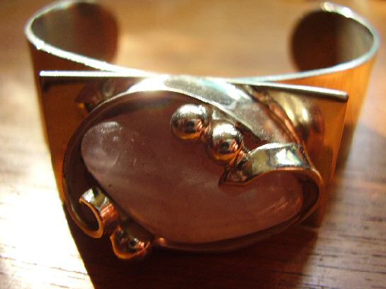
Rose quartz is a gentler stone than the labradorite and amethyst that dominate much of this collection, soft, translucent pink rather than dramatic colour-shift or saturated purple. Chromica’s Danish workshop paired it with the same structural, confidently minimal silverwork running through the rest of this collection’s Scandinavian pieces, proof that the mid-century Danish design language could handle a genuinely soft palette without losing its underlying discipline.

The bangle form itself is unforgiving in a way a pendant or brooch isn’t, it has to hold its shape and proportion from every angle, worn on a moving wrist rather than sitting still against fabric. Getting a large, softly coloured stone to feel structural rather than merely pretty in that format is a genuine design achievement, not a given.

Why softer stones are worth taking as seriously as dramatic ones. It would be easy to read restraint and quiet colour as a lesser design statement than labradorite’s dramatic flash or amethyst’s saturated purple. That undersells the actual difficulty: making a soft, low-contrast stone feel intentional and substantial, rather than simply muted, takes just as much design confidence as working with a more dramatic material.

What to look for. The rose quartz should show genuine, if subtle, translucency rather than being opaque or overly pale, and the Chromica mark should be clear. Both are present here.

This piece has since sold. It was part of a small, genuinely personal collection of mid-century jewellery, gathered over years rather than acquired for resale. See the Chromica rose quartz bangle on Gozotiques.

An Anette Borke Huge Agate Bangle: Denmark Working at Real Scale

Or: sometimes restraint means letting one enormous stone do all the talking

Anette Borke Denmark Huge Agate Bangle

Most of the mid-century Scandinavian silverwork in this collection makes its case through proportion and structure at a fairly modest scale. This bangle takes a different approach entirely: a genuinely large agate, banded in the mineral’s characteristic layered pattern, set as the whole point of the piece rather than one element among several. Anette Borke’s Danish workshop clearly understood that sometimes the most modernist decision available is simply to get out of the stone’s way.

Agate’s banding is entirely natural, no two stones cut the same way twice, which means a piece built around a stone this size is also, inevitably, a one-off. The silverwork here is confident enough to frame that scale without fighting it, structural rather than delicate, built to actually carry the visual weight of the stone rather than merely hold it in place.

Why scale itself is a design decision. A smaller stone in the same setting would read as a conventional bangle with a nice accent. At this size, the agate stops being decoration and becomes the actual subject, the same shift in thinking that separates a competent piece of jewellery from a genuinely confident one.

What to look for. The banding should show genuine natural variation and depth under light, rather than a flat, uniform colour that might suggest dyed or lower-grade material. This stone shows the real thing.

This piece has since sold. It was part of a small, genuinely personal collection of mid-century and antique jewellery, gathered over years rather than acquired for resale. See the Anette Borke agate bangle on Gozotiques.

An Erik Dennung Pendant for Buch & Deichmann: A Danish Collaboration Worth Knowing

Or: when a designer’s name and a retailer’s name both end up on the same piece

Erik Dennung for Buch and Deichmann pendant

This pendant carries a double attribution: Erik Dennung as designer, Buch & Deichmann as the retail house that commissioned or sold it. That kind of pairing was common in mid-century Danish design, a working designer producing pieces under a retailer’s name or in direct collaboration with them, rather than every piece being sold purely under the maker’s own independent mark, the way Erik Dennung’s fossil and other solo-marked pieces elsewhere in this collection were.

It’s worth understanding this distinction, since it changes what you’re actually looking at. A solo-marked piece tells you the maker sold it directly under their own name. A piece like this tells you something about the wider commercial structure of Danish design retail at the time, working designers and established retail houses building pieces together, each lending the other credibility.

Why this matters for dating and provenance. A dual attribution like this is often easier to research than a purely independent workshop mark, since it ties the piece to a known retail house with its own records, not just a single maker’s output. That’s a real practical advantage for anyone trying to properly place a piece in its context.

What to look for. Both marks, designer and retailer, should be present and legible, exactly as they are here, a piece missing one or the other is worth a closer look before assuming the full attribution.

This piece has since sold. It was part of a small, genuinely personal collection of mid-century and antique jewellery, gathered over years rather than acquired for resale. See the Erik Dennung for Buch & Deichmann pendant on Gozotiques.

An Erik Dennung Fossil Pendant: When Denmark Set Deep Time in Silver

Or: the stone in this pendant is older than the design movement it’s set into by several hundred million years

Erik Dennung Denmark fossil pendant

Danish mid-century silver design mostly reached for polished stones, agate, amethyst, labradorite, chosen for colour and clarity. A genuine fossil is a stranger, more deliberate choice: the stone isn’t decorative in the usual sense, it’s a literal record of ancient life, and setting one in silver is a design decision that only works if the maker trusts the material to be interesting on its own terms.

Erik Dennung’s setting here does exactly that: restrained, structural silverwork that frames the fossil rather than competing with it. It fits the same broader Scandinavian design philosophy running through this whole collection, honest material, minimal ornament, but applied to a stone that’s carrying millions of years of geological history rather than just a pleasing colour.

Why fossil jewellery is a genuinely different collecting category. A polished gemstone is valued for clarity and colour. A fossil is valued for what it actually is, real evidence of an organism that existed at a specific point in deep time. Wearing one is a different kind of object entirely from wearing a cut amethyst, closer to owning a small, wearable piece of natural history than a conventional jewel.

What to look for. The fossil’s structure should be genuinely visible and legible under close inspection, not just a vaguely textured stone, this piece shows real, identifiable detail rather than an ambiguous mineral pattern.

This piece has since sold. It was part of a small, genuinely personal collection of mid-century and antique jewellery, gathered over years rather than acquired for resale. See the Erik Dennung fossil pendant on Gozotiques.

A Hermann Siersbol Silver Bracelet: Denmark’s Quiet Modernist

Or: the Danish name that never chased the spotlight the way Georg Jensen did

Hermann Siersbol Denmark silver bracelet

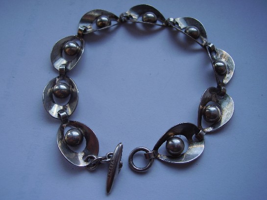
Ask most people to name a Danish silver house and they’ll say Georg Jensen, and stop there. Hermann Siersbol’s workshop, active through the mid-20th century, made pieces of comparable craftsmanship without ever building the same brand recognition outside Denmark. That’s actually useful for a collector: the workmanship is genuinely there, the international name premium mostly isn’t.

This bracelet shows the restrained, structural approach typical of Danish silver design in this period, weight and proportion doing the work, rather than surface decoration. It’s the same broad design language as its more famous countrymen, smooth forms, honest material, minimal embellishment, just from a workshop that stayed smaller and quieter.

Why smaller workshops matter to the wider story. Denmark’s mid-century silver reputation wasn’t built by one firm alone. It came from a whole ecosystem of workshops, some world-famous, many not, all working from broadly the same design principles. Siersbol pieces are a genuine, representative example of that wider movement, not an imitation of it.

What to look for. Danish silver from this period is reliably well-hallmarked, so a clear, legible mark and consistent silver content are the first things worth checking, and both are present here.

This piece has since sold. It was part of a small, genuinely personal collection of mid-century and antique jewellery, gathered over years rather than acquired for resale. See the Hermann Siersbol bracelet on Gozotiques.