
A Silver and Enamel Suffragette Brooch, Circa 1900: Jewellery as Political Statement

Or: when wearing the wrong colour combination was itself a form of protest
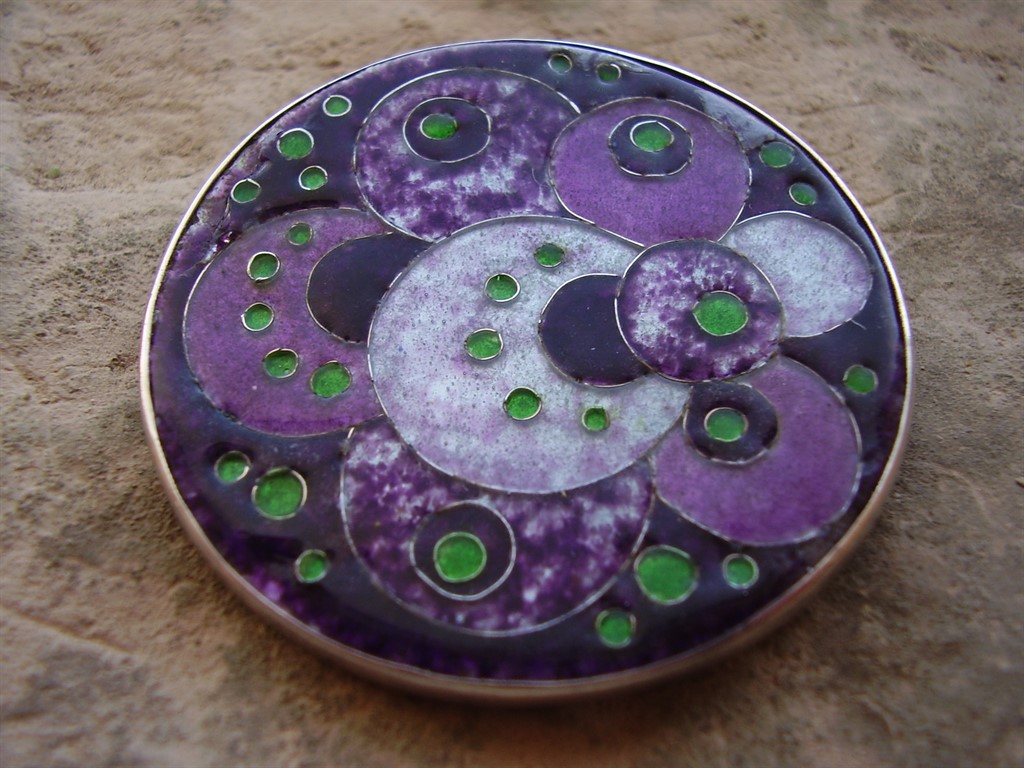
Silver and Enamel Arts and Crafts Suffragette Brooch

The Women’s Social and Political Union adopted purple, white, and green as its official colours in 1908, purple for dignity, white for purity, green for hope, and suffragette-sympathetic jewellers began producing pieces using exactly that palette almost immediately. This Arts and Crafts brooch, English, circa 1900, sits at the edge of that movement: silver and enamel work in the handmade, unpretentious style the Arts and Crafts movement favoured, a deliberate rejection of mass-produced Victorian jewellery in favour of visible, honest craftsmanship.

Arts and Crafts jewellery and the suffrage movement shared more than a historical moment, they shared an underlying philosophy: both were reactions against an establishment seen as ornamental, hollow, and resistant to genuine change. A woman choosing to wear a piece like this wasn’t just making an aesthetic choice, in the specific political climate of the period, it could be read as a visible, public statement.

Why this piece matters beyond its craftsmanship. Genuine suffrage-era jewellery is a real, if narrow, category of political and social history that happens to also be wearable. It sits at the intersection of design history and a specific, documented civil rights movement, which gives a piece like this a layer of significance that a purely decorative brooch from the same period wouldn’t carry.

What to look for. Hand-finished, slightly irregular enamel work and a visible hallmark consistent with the period, both present here, are what distinguish genuine Arts and Crafts pieces from later, more mechanically produced imitations of the style.

This piece is part of a small, genuinely personal collection of antique jewellery, gathered over years rather than acquired for resale. See the Suffragette brooch on Gozotiques.
A Laurana Italy Enamel Bangle, 1960s: Italian Colour Meets Modernist Form

Or: Italy’s own take on the same design conversation the rest of Europe was having

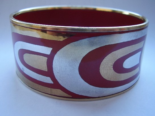
Laurana Italy 1960's Enamel Bangle

Italian mid-century design gets celebrated constantly in furniture and industrial design, Olivetti, the great postwar Milanese studios, but Italian jewellery from the same period gets talked about far less outside specialist circles. Laurana’s enamelled bangle is a useful corrective: the same postwar confidence in bold form and colour that defined Italian product design shows up here too, just applied to something worn on the wrist instead of sitting on a desk.

Where the Scandinavian pieces in this collection tend toward restraint and the natural colour of silver itself, this bangle leans into enamel’s saturated colour range, a distinctly Italian design instinct: form matters, but so does colour, and there’s no need to apologise for wanting both.

Why Italian mid-century jewellery deserves more attention than it gets. It sits in an odd gap: not old enough to be conventional antique jewellery, not famous enough as a design category to command the same collector interest as Italian furniture or glass from the same decades. That gap is exactly where genuinely good pieces can still be found without paying a premium purely for name recognition.

What to look for. The enamel should be glossy and fully intact with no hairline cracking, since enamelled pieces are always more fragile than plain metalwork, condition matters more here than with an equivalent silver-only piece.

This piece has since sold. It was part of a small, genuinely personal collection of mid-century and antique jewellery, gathered over years rather than acquired for resale. See the Laurana Italy enamel bangle on Gozotiques.

A Castelan Mexico Enamelled Brooch: Colour Enters the Modernist Story

Or: not every mid-century Mexican silver piece stayed within silver’s own colour range

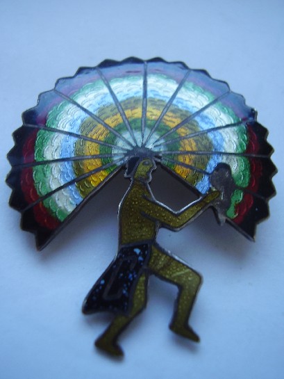
Castelan Mexico enamelled brooch

Most of Mexico’s mid-century modernist silver, Los Ballesteros and Holzerco among the names elsewhere in this collection, worked within silver’s own tonal range, letting form and surface texture carry the design rather than colour. Castelan’s enamelled work takes a different route: bright, fired colour applied directly onto the silverwork, bringing genuine colour into a design tradition that mostly didn’t reach for it.

Enamelling is an unforgiving technique, glass-based colour fused to metal at high heat, prone to cracking or discolouring if the underlying craftsmanship isn’t precise. A well-preserved enamelled piece from this period is a genuine test of both the original maker’s skill and how carefully the piece has been kept since. This brooch passes both tests: clean, vivid colour with no visible cracking or wear to the enamel surface.

Why colour changes the collecting calculus. An enamelled piece is inherently more fragile than a purely silverwork one, which makes surviving examples in genuinely good condition more significant than their monochrome counterparts, not less. Condition does more of the work in determining real value here than it does with plain silver.

What to look for. Enamel should sit flush with the metal, glossy and unbroken, with no visible hairline cracks radiating from the edges, exactly the condition this piece is in.

This piece has since sold. It was part of a small, genuinely personal collection of mid-century and antique jewellery, gathered over years rather than acquired for resale. See the Castelan Mexico brooch on Gozotiques.