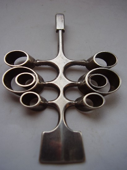
A Gorgeous Apollo Studios New York Cherry Ice Bucket: Mid-Century American Barware

Or: modernist design didn’t stop at jewellery, it ran the whole cocktail cart

Everything else in this collection is jewellery, and this piece is a useful reminder that the same mid-century design instincts, honest material, bold simplified form, real craft applied to everyday objects, ran through entertaining and barware just as much as through what people wore. Apollo Studios, working out of New York, applied a cherry motif to this ice bucket with exactly the same confident, decorative modernism found in the era’s best jewellery design.

Mid-century entertaining had its own genuine design culture, cocktail shakers, ice buckets, serving pieces, all treated as objects worth real design attention rather than purely functional afterthoughts. A well-made piece like this one sat at the centre of postwar American hospitality the way a good coffee table or credenza sat at the centre of the room around it.

Why barware collecting is its own genuine category. Mid-century barware gets far less serious collector attention than furniture or jewellery from the same period, despite often showing the same level of design ambition. That gap between attention and actual quality is exactly where a piece like this offers real value to anyone actually looking rather than just following the crowd.

What to look for. The cherry motif’s detailing should be crisp and the metal finish free of significant pitting or corrosion, both signs of a piece that’s been kept properly rather than left in damp storage. This one is in genuinely good condition.

This piece has since sold. It was part of a small, genuinely personal collection of mid-century antiques, gathered over years rather than acquired for resale. See the Apollo Studios ice bucket on Gozotiques.

[Image pending, to be added once source photo is confirmed.]
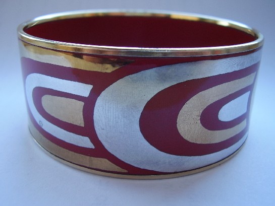
A Laurana Italy Enamel Bangle, 1960s: Italian Colour Meets Modernist Form

Or: Italy’s own take on the same design conversation the rest of Europe was having

Laurana Italy 1960's Enamel Bangle

Italian mid-century design gets celebrated constantly in furniture and industrial design, Olivetti, the great postwar Milanese studios, but Italian jewellery from the same period gets talked about far less outside specialist circles. Laurana’s enamelled bangle is a useful corrective: the same postwar confidence in bold form and colour that defined Italian product design shows up here too, just applied to something worn on the wrist instead of sitting on a desk.

Where the Scandinavian pieces in this collection tend toward restraint and the natural colour of silver itself, this bangle leans into enamel’s saturated colour range, a distinctly Italian design instinct: form matters, but so does colour, and there’s no need to apologise for wanting both.

Why Italian mid-century jewellery deserves more attention than it gets. It sits in an odd gap: not old enough to be conventional antique jewellery, not famous enough as a design category to command the same collector interest as Italian furniture or glass from the same decades. That gap is exactly where genuinely good pieces can still be found without paying a premium purely for name recognition.

What to look for. The enamel should be glossy and fully intact with no hairline cracking, since enamelled pieces are always more fragile than plain metalwork, condition matters more here than with an equivalent silver-only piece.

This piece has since sold. It was part of a small, genuinely personal collection of mid-century and antique jewellery, gathered over years rather than acquired for resale. See the Laurana Italy enamel bangle on Gozotiques.

David Andersen: The Norwegian Silver House That Outlasted a Century

Or: what a 130-year-old firm looks like when it’s still making things worth owning

David Andersen silver pendant, 1960s

David Andersen founded his Oslo silversmithing house in 1876. Most 19th-century jewellery firms either folded or fossilised into producing the same designs for decades. David Andersen did neither, it kept adapting through Art Nouveau, into enamel work, through mid-century modernism, and the company still operates in Norway today. This pendant comes from that 1960s modernist stretch, clean lines, deliberately understated, a long way from the firm’s ornate 19th-century enamel pieces but unmistakably still built to the same standard.

Why longevity like this actually matters to a collector. A firm that’s operated continuously for a century and a half has an unbroken paper trail, consistent hallmarking standards, and a design archive that scholars and auction houses can actually cross-reference. That’s a real practical advantage over an obscure workshop that operated for five years and left no records. You can date and verify a David Andersen piece with real confidence.

The 1960s pivot, specifically. Like a lot of European silver houses, David Andersen’s mid-century output shows a deliberate move away from ornament toward form, letting the silver itself, its weight and surface, do the work rather than layering on decoration. It’s a design philosophy that’s aged well; pieces from this period don’t look dated the way more ornate Victorian or Edwardian work sometimes does.

What to look for. The house mark should be crisp and the silver content properly stamped, David Andersen has kept consistent hallmarking standards across its whole history, which is exactly what makes a vague or worn mark worth being cautious about.

This piece has since sold. It was part of a small, genuinely personal collection of mid-century and antique jewellery, gathered over years rather than acquired for resale. See the David Andersen pendant on Gozotiques.