An Anette Borke Huge Agate Bangle: Denmark Working at Real Scale

Or: sometimes restraint means letting one enormous stone do all the talking
Anette Borke Denmark Huge Agate Bangle

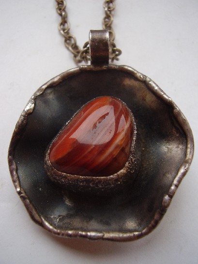
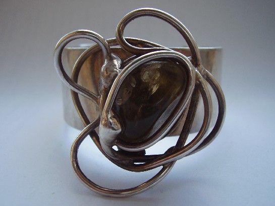
Most of the mid-century Scandinavian silverwork in this collection makes its case through proportion and structure at a fairly modest scale. This bangle takes a different approach entirely: a genuinely large agate, banded in the mineral’s characteristic layered pattern, set as the whole point of the piece rather than one element among several. Anette Borke’s Danish workshop clearly understood that sometimes the most modernist decision available is simply to get out of the stone’s way.

Agate’s banding is entirely natural, no two stones cut the same way twice, which means a piece built around a stone this size is also, inevitably, a one-off. The silverwork here is confident enough to frame that scale without fighting it, structural rather than delicate, built to actually carry the visual weight of the stone rather than merely hold it in place.

Why scale itself is a design decision. A smaller stone in the same setting would read as a conventional bangle with a nice accent. At this size, the agate stops being decoration and becomes the actual subject, the same shift in thinking that separates a competent piece of jewellery from a genuinely confident one.

What to look for. The banding should show genuine natural variation and depth under light, rather than a flat, uniform colour that might suggest dyed or lower-grade material. This stone shows the real thing.

This piece has since sold. It was part of a small, genuinely personal collection of mid-century and antique jewellery, gathered over years rather than acquired for resale. See the Anette Borke agate bangle on Gozotiques.
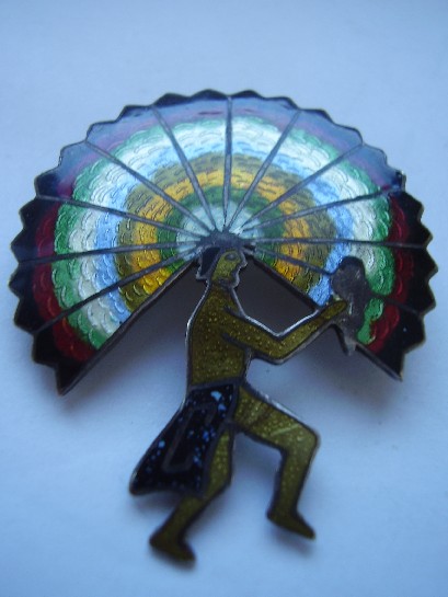
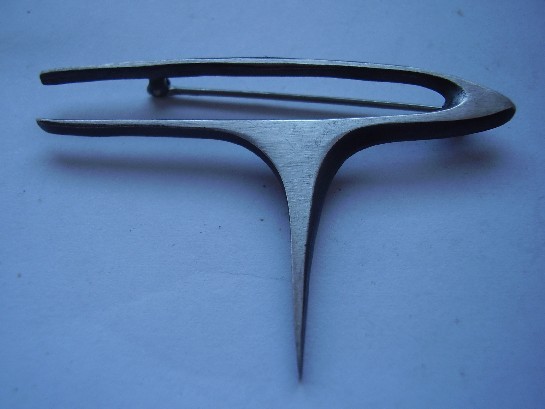
A Castelan Mexico Enamelled Brooch: Colour Enters the Modernist Story

Or: not every mid-century Mexican silver piece stayed within silver’s own colour range

Castelan Mexico enamelled brooch

Most of Mexico’s mid-century modernist silver, Los Ballesteros and Holzerco among the names elsewhere in this collection, worked within silver’s own tonal range, letting form and surface texture carry the design rather than colour. Castelan’s enamelled work takes a different route: bright, fired colour applied directly onto the silverwork, bringing genuine colour into a design tradition that mostly didn’t reach for it.

Enamelling is an unforgiving technique, glass-based colour fused to metal at high heat, prone to cracking or discolouring if the underlying craftsmanship isn’t precise. A well-preserved enamelled piece from this period is a genuine test of both the original maker’s skill and how carefully the piece has been kept since. This brooch passes both tests: clean, vivid colour with no visible cracking or wear to the enamel surface.

Why colour changes the collecting calculus. An enamelled piece is inherently more fragile than a purely silverwork one, which makes surviving examples in genuinely good condition more significant than their monochrome counterparts, not less. Condition does more of the work in determining real value here than it does with plain silver.

What to look for. Enamel should sit flush with the metal, glossy and unbroken, with no visible hairline cracks radiating from the edges, exactly the condition this piece is in.

This piece has since sold. It was part of a small, genuinely personal collection of mid-century and antique jewellery, gathered over years rather than acquired for resale. See the Castelan Mexico brooch on Gozotiques.

An Esther Lewittes Sterling Brooch: American Studio Jewellery’s Quiet Corner

Or: modernism in America wasn’t only happening in Rebajes’ Greenwich Village workshop

Esther Lewittes sterling brooch

Frank Rebajes gets most of the attention when American mid-century modernist jewellery comes up, and deservedly, but he wasn’t working alone. A wider community of American studio jewellers, Esther Lewittes among them, were producing sterling silver work through the same period, applying the same broad modernist instincts, structural form, honest material, minimal ornament, without necessarily building the same level of commercial fame.

This brooch is a genuine example of that wider studio jewellery movement, American mid-century modernism as a real, broad-based craft culture rather than the output of one or two famous names. It’s worked in sterling rather than Rebajes’ signature copper, which itself says something: not every American modernist workshop was chasing the same affordable-material strategy, some worked in precious metal from the start.

Why the wider studio movement matters, not just the famous names. American studio jewellery in this period was genuinely decentralised, small workshops and individual makers across the country, not one dominant style radiating out from a single figure. Understanding that wider context is part of what makes a single well-attributed piece like this genuinely interesting, rather than treating it as a footnote to Rebajes.

What to look for. A clear sterling stamp alongside the maker’s mark, both present here, confirms genuine precious-metal studio work rather than a plated reproduction.

This piece has since sold. It was part of a small, genuinely personal collection of mid-century and antique jewellery, gathered over years rather than acquired for resale. See the Esther Lewittes brooch on Gozotiques.

A German Modernist Silver and Amethyst Ring: The Bauhaus Instinct in Miniature

Or: Germany had its own answer to Scandinavian restraint

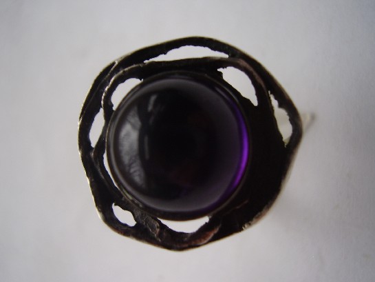
German Modernist silver and amethyst ring

Scandinavian names tend to dominate any conversation about mid-century modernist jewellery, but Germany’s own postwar design culture, shaped heavily by the Bauhaus legacy a generation earlier, produced a genuinely parallel tradition. Function over ornament, structure over decoration, honest material over illusion, the same design commandments, arrived at independently through a different national design history.

This ring shows that lineage clearly: a substantial amethyst held in silverwork that prioritises clean geometric structure over elaborate setting. It’s recognisably part of the same broad mid-century movement as the Scandinavian pieces elsewhere in this collection, while carrying a slightly different design accent, marginally more architectural, less organic, consistent with German design’s own particular inheritance from Bauhaus functionalism.

Why the Bauhaus connection matters here. The Bauhaus movement formally ended in 1933, but its core design principles, strip away ornament, let function and material dictate form, didn’t disappear with it. They resurfaced across German craft and product design for decades afterward, jewellery included. A ring like this carries that inheritance whether or not its maker ever set foot in the original school.

What to look for. The amethyst should be securely and cleanly set within the geometric silverwork, with no gaps or crude soldering visible, exactly what separates genuine period craftsmanship from a rougher reproduction. This one is cleanly made.

This piece has since sold. It was part of a small, genuinely personal collection of mid-century and antique jewellery, gathered over years rather than acquired for resale. See the German Modernist ring on Gozotiques.

A Relo Silver Ring: A Modernist Mark Worth Tracking Down

Or: another maker’s name that rewards actual research over assumption

Relo silver ring

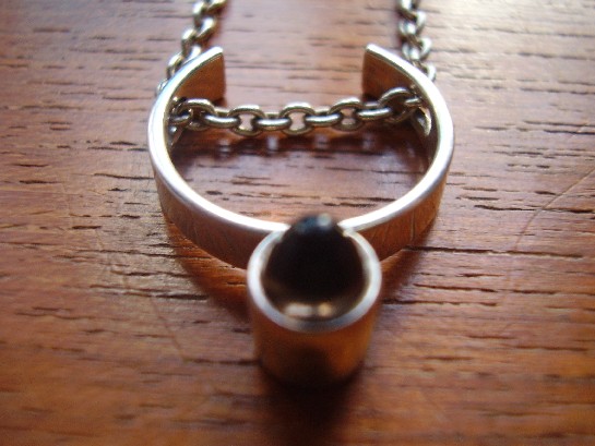
Not every mark in mid-century silver design belongs to a household name, and Relo is one of the marks that takes real digging to place with confidence. What’s not in question is the design itself: clean, structural modernist silverwork, entirely consistent with the wider mid-century movement running through this whole collection, restrained form, honest material, no unnecessary ornament.

This is exactly the kind of piece where collecting genuinely rewards curiosity over brand recognition. The maker’s mark is the starting point for research, not the end of it, and a piece doesn’t need a famous name to demonstrate real design quality. Judged purely on the silverwork, this ring holds its own against far more documented names elsewhere in this collection.

Why this matters for how a collection like this gets built. A collection assembled by someone who genuinely cared about the pieces, rather than chasing only recognisable names, ends up including exactly this kind of piece: bought because it was good, not because it was famous. That’s a meaningfully different collecting instinct from one built purely around resale value.

What to look for. The mark itself, clear and legible, alongside consistent silver content, both present here, are the starting point for anyone who wants to research this maker further.

This piece has since sold. It was part of a small, genuinely personal collection of mid-century and antique jewellery, gathered over years rather than acquired for resale. See the Relo silver ring on Gozotiques.

An Elis Kauppi Silver Ring: The Same Hand, a Different Scale Again

Or: how a signature design language survives shrinking down to finger size

Elis Kauppi Kupittaan Kulta silver ring

Between the substantial silver and labradorite torque and this ring, this collection now holds Elis Kauppi’s work at three genuinely different scales, neckpiece, brooch, and finger, and the same design instincts hold across all of them. That’s a real test of a designer’s consistency: it’s one thing to have a signature look at a single scale, and another to keep the same structural logic legible when the object shrinks down to something worn on a single finger.

This ring shows the same restrained, structural silverwork as his larger pieces, just compressed. Nothing about it reads as a scaled-down version of a bigger idea, it’s a fully resolved design in its own right, which is exactly what separates a designer with a genuine underlying philosophy from one who just has a single recognisable trick.

Why rings are actually the hardest test of a design language. A ring has almost no surface to work with compared to a pendant or brooch, and it has to survive constant handling and wear in a way a brooch doesn’t. Getting a signature style to still read clearly at that scale, while staying genuinely wearable day to day, is a harder design problem than it looks.

What to look for. The Kupittaan Kulta and Kauppi marks should both be legible despite the ring’s small surface area, a genuine test of whether a piece has been worn hard enough to blur its own maker’s mark. This one is still clearly stamped.

This piece has since sold. It was part of a small, genuinely personal collection of mid-century and antique jewellery, gathered over years rather than acquired for resale. See the Elis Kauppi ring on Gozotiques.

A Kupittaan Kulta Tiger’s Eye Brooch: Elis Kauppi Working in Brown and Gold

Or: the stone that looks like it’s lit from inside

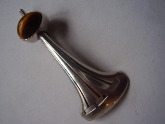
Kupittaan Kulta Elis Kauppi silver and tiger's eye brooch

Tiger’s eye is a chatoyant stone, meaning it shows a moving band of light across its surface as it turns, the same optical effect, on a warmer palette, that makes labradorite so prized in the Kauppi torque elsewhere in this collection. Where that piece used labradorite’s cool blue-green flash, this brooch works in tiger’s eye’s warm brown and gold, a genuinely different mood from the same underlying design instinct: let the stone’s own optical behaviour do the visual work, and build the silver setting to support that rather than compete with it.

It’s a smaller, quieter piece than the torque, a brooch rather than a statement neckpiece, but it carries exactly the same design DNA. Seeing Kauppi apply the same underlying philosophy across such a different scale and stone is a genuinely useful way to understand what actually made his work consistent: not a single signature look, but a consistent way of thinking about the relationship between metal and stone.

Why tiger’s eye specifically suited this design language. The stone’s chatoyancy depends on the cut catching the light at the right angle, which meant Kauppi’s structural, often slightly raised settings weren’t just aesthetic choices, they genuinely served the stone’s optical properties, tilting it toward the light rather than burying it flat.

What to look for. The chatoyant band should move visibly as the brooch is tilted, a static-looking stripe suggests a lower-grade stone or a poor cut. This one shows the effect clearly.

This piece has since sold. It was part of a small, genuinely personal collection of mid-century and antique jewellery, gathered over years rather than acquired for resale. See the Kupittaan Kulta Tiger’s Eye brooch on Gozotiques.

An Erik Dennung Pendant for Buch & Deichmann: A Danish Collaboration Worth Knowing

Or: when a designer’s name and a retailer’s name both end up on the same piece

Erik Dennung for Buch and Deichmann pendant

This pendant carries a double attribution: Erik Dennung as designer, Buch & Deichmann as the retail house that commissioned or sold it. That kind of pairing was common in mid-century Danish design, a working designer producing pieces under a retailer’s name or in direct collaboration with them, rather than every piece being sold purely under the maker’s own independent mark, the way Erik Dennung’s fossil and other solo-marked pieces elsewhere in this collection were.

It’s worth understanding this distinction, since it changes what you’re actually looking at. A solo-marked piece tells you the maker sold it directly under their own name. A piece like this tells you something about the wider commercial structure of Danish design retail at the time, working designers and established retail houses building pieces together, each lending the other credibility.

Why this matters for dating and provenance. A dual attribution like this is often easier to research than a purely independent workshop mark, since it ties the piece to a known retail house with its own records, not just a single maker’s output. That’s a real practical advantage for anyone trying to properly place a piece in its context.

What to look for. Both marks, designer and retailer, should be present and legible, exactly as they are here, a piece missing one or the other is worth a closer look before assuming the full attribution.

This piece has since sold. It was part of a small, genuinely personal collection of mid-century and antique jewellery, gathered over years rather than acquired for resale. See the Erik Dennung for Buch & Deichmann pendant on Gozotiques.

An Erik Dennung Fossil Pendant: When Denmark Set Deep Time in Silver

Or: the stone in this pendant is older than the design movement it’s set into by several hundred million years

Erik Dennung Denmark fossil pendant

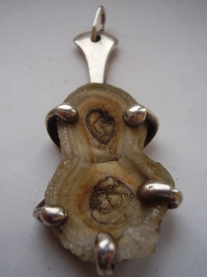
Danish mid-century silver design mostly reached for polished stones, agate, amethyst, labradorite, chosen for colour and clarity. A genuine fossil is a stranger, more deliberate choice: the stone isn’t decorative in the usual sense, it’s a literal record of ancient life, and setting one in silver is a design decision that only works if the maker trusts the material to be interesting on its own terms.

Erik Dennung’s setting here does exactly that: restrained, structural silverwork that frames the fossil rather than competing with it. It fits the same broader Scandinavian design philosophy running through this whole collection, honest material, minimal ornament, but applied to a stone that’s carrying millions of years of geological history rather than just a pleasing colour.

Why fossil jewellery is a genuinely different collecting category. A polished gemstone is valued for clarity and colour. A fossil is valued for what it actually is, real evidence of an organism that existed at a specific point in deep time. Wearing one is a different kind of object entirely from wearing a cut amethyst, closer to owning a small, wearable piece of natural history than a conventional jewel.

What to look for. The fossil’s structure should be genuinely visible and legible under close inspection, not just a vaguely textured stone, this piece shows real, identifiable detail rather than an ambiguous mineral pattern.

This piece has since sold. It was part of a small, genuinely personal collection of mid-century and antique jewellery, gathered over years rather than acquired for resale. See the Erik Dennung fossil pendant on Gozotiques.

A Kupittaan Kulta Smoky Quartz Pendant: Elis Kauppi Without the Kinetics

Or: what his design language looks like when it holds still

Kupittaan Kulta Elis Kauppi smoky quartz silver pendant

Elis Kauppi is best known, at least in this collection, for kinetic pieces, jewellery built with parts that genuinely move. This smoky quartz pendant shows the other side of his design language: fixed, structural, but still unmistakably his, the same confident, sculptural silverwork built around the stone rather than simply holding it in place. It’s a useful reminder that a designer’s signature isn’t just their showiest trick, it’s the underlying design logic that holds even when the trick isn’t present.

Smoky quartz was a favoured stone across Scandinavian mid-century jewellery generally, warm, subtle, and far less showy than amethyst or labradorite, which suited the movement’s broader preference for restraint over spectacle. Kauppi’s setting here lets the stone’s quiet colour do the work rather than competing with an elaborate mount.

Why this piece is worth having alongside his kinetic work. Seeing a designer’s static pieces next to their more experimental ones tells you more about their actual design instincts than either alone. The same structural confidence, the same relationship between metal and stone, runs through both, kinetics turn out to be an expression of that underlying language, not a separate trick layered on top of it.

What to look for. Genuine smoky quartz shows real depth and slight variation in its brown-grey tone under different light, a flat, uniformly dark stone is worth a second look. This one shows the real thing.

This piece has since sold. It was part of a small, genuinely personal collection of mid-century and antique jewellery, gathered over years rather than acquired for resale. See the Kupittaan Kulta smoky quartz pendant on Gozotiques.