A K & E Carlson Cesons Amethyst Pendant Bracelet: Sweden’s Lesser-Known Silver House

Or: the maker’s mark that takes real digging to place
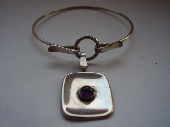
K and E Carlson Cesons silver amethyst pendant bracelet

Not every mid-century Scandinavian workshop left the kind of documentation trail that David Andersen or Georg Jensen did. K & E Carlson, working under the Cesons mark, is one of the harder Swedish houses to research in real depth, the kind of name that turns up reliably on genuine period pieces but doesn’t have a tidy Wikipedia page waiting to explain it. That’s not a flaw in the piece, it’s just the reality of how much mid-century Scandinavian craft production has never been fully catalogued.

This bracelet, built around an amethyst pendant, shows all the hallmarks of the wider Swedish silver tradition of the period, clean structural setting, honest silverwork, a stone chosen and cut to suit the design rather than simply maximise size. It sits comfortably alongside better-documented names from the same era and country without needing their name recognition to justify the craftsmanship.

Why under-documented makers are worth collecting anyway. A piece doesn’t need a famous name attached to be a genuine, well-made example of its period and movement. If anything, tracking down exactly who Cesons was is part of what makes a piece like this interesting to actually own, rather than just display.

What to look for. The Cesons mark itself, alongside standard Swedish silver hallmarks, is the main way to verify a piece like this, both are clear and legible here.

This piece has since sold. It was part of a small, genuinely personal collection of mid-century and antique jewellery, gathered over years rather than acquired for resale. See the K & E Carlson bracelet on Gozotiques.
An Erik Granit Silver Bracelet, 1972: Finnish Craft at Its Peak Decade

Or: why the early 1970s might be the single best-documented moment in Finnish silver design

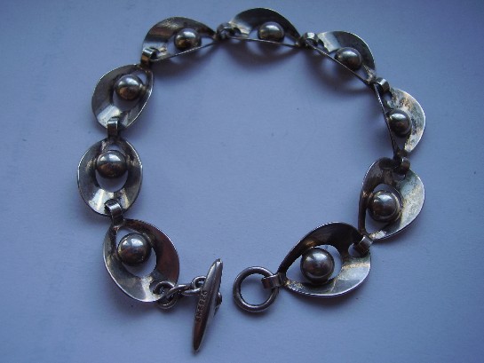
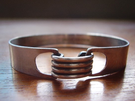
Erik Granit Finland silver bracelet 1972

By 1972, when this bracelet was made, Finnish silver design had spent a solid two decades building the reputation that still defines it today. The Kupittaan Kulta workshops, Kalevala Koru, and independent makers like Erik Granit were all working from a shared, matured design vocabulary, structural silverwork, honest surfaces, forms that owed more to sculpture than to traditional ornament. This bracelet is a confident, fully realised example of exactly that moment.

A dated piece like this one is genuinely useful to a collector in a way an undated piece isn’t. Knowing it’s 1972 rather than a vague ‘mid-century’ places it precisely at the point where Finnish modernist silver had moved past its early experimental phase and into full maturity, the design confidence of a movement that knows exactly what it’s doing, not still working out what it wants to be.

Why independent makers matter alongside the famous workshops. Kupittaan Kulta gets most of the attention in any account of this period, deservedly, but the wider strength of Finnish design in the 1960s and 70s came from a genuinely broad base of makers working to a shared standard, not one workshop carrying the whole movement. Granit is part of that wider foundation.

What to look for. A clear date mark alongside the maker’s stamp, exactly as this piece has, is worth more to a collector than an undated piece from a more famous name, precision beats prestige when you’re actually trying to understand a design movement rather than just collect a signature.

This piece has since sold. It was part of a small, genuinely personal collection of mid-century and antique jewellery, gathered over years rather than acquired for resale. See the Erik Granit bracelet on Gozotiques.

An Orb Sterling Sleeping Cat Brooch: When Modernism Allowed Itself to Be Charming

Or: not every mid-century piece was about austere restraint

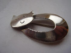
Orb Sterling sleeping cat brooch

A lot of what defines mid-century modernist jewellery is restraint, clean form, honest material, minimal ornament. This sleeping cat brooch is a reminder that the same designers working in that language were entirely capable of warmth and humour too. It’s figurative rather than abstract, clearly a curled, sleeping cat, but rendered with the same structural, simplified sensibility as the more austere pieces elsewhere in this collection.

Figurative modernist jewellery, animals especially, occupied a real place in mid-century design, not a lapse from the movement’s principles but an extension of them: take a familiar, everyday subject and render it through the same simplified, structural lens applied to purely abstract forms. A sleeping cat, reduced to its essential curled silhouette, is arguably a harder design problem than an abstract geometric brooch, since it still has to read unmistakably as a cat.

Why pieces like this are worth taking seriously. It’s easy to file figurative animal brooches under ‘charming’ and stop there, treating them as lesser than the more austere abstract work. That undersells the actual design discipline involved: simplifying a recognisable, expressive form down to its essentials without losing what makes it recognisable is a genuine skill, not a lesser one.

What to look for. The silhouette should read clearly as a sleeping cat from across a room, not just up close, that’s the actual test of whether the simplification succeeded. This one passes easily.

This piece has since sold. It was part of a small, genuinely personal collection of mid-century and antique jewellery, gathered over years rather than acquired for resale. See the Orb Sterling cat brooch on Gozotiques.

An Aarikka Turned Wood Pendant: Finland’s Other Design Tradition

Or: not every Finnish design story is told in silver

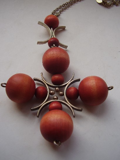
Aarikka Finland 1960s turned wood pendant

Finland’s mid-century design reputation is easy to tell entirely through metalwork, Kupittaan Kulta, Kalevala Koru, the silver houses that dominate any conversation about Scandinavian jewellery. Aarikka told a different, equally Finnish story, founded in 1962 by Kaija Aarikka, working almost entirely in turned wood rather than precious metal.

This pendant is a good example of why that mattered. Wood was cheap, domestic, and unmistakably Finnish, birch and other native timbers were the actual material of everyday Finnish life in a way imported silver never quite was. Aarikka’s turned, simplified forms, this pendant’s smooth, rounded geometry among them, took that humble material and gave it exactly the same design seriousness the silver houses were applying to precious metal.

Why this matters for how the whole movement gets remembered. Scandinavian mid-century design gets summarised, often, as a story about wealth and precious materials handled with restraint. Aarikka is a useful corrective: the same design instincts, honest material, clean form, no unnecessary ornament, worked just as well applied to a piece of turned birch as to a bar of silver. The philosophy was the point, not the metal.

What to look for. The turning should be smooth and even, with the wood’s natural grain left visible rather than painted over, that respect for the material’s own character is the whole point of the design, and it’s intact here.

This piece has since sold. It was part of a small, genuinely personal collection of mid-century and antique jewellery, gathered over years rather than acquired for resale. See the Aarikka wood pendant on Gozotiques.

A Holzerco Moebius Strip Bangle: Mexican Silver Meets Topology

Or: the jewellery form that’s technically a one-sided surface

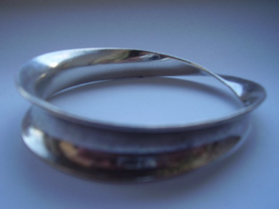
Holzerco Mexico Moebius strip silver bangle

A Möbius strip is a genuinely strange piece of mathematics before it’s ever a piece of jewellery, take a strip, give it a half-twist, join the ends, and the resulting surface has only one side and one edge. Trace a finger along it and you’ll cover both what looks like the front and the back without ever lifting off. It’s a favourite shape in mid-century design precisely because it looks impossible while being simple to actually make.

Holzerco, working out of Mexico, rendered it in silver as a bangle, and the effect works exactly as it should: turn it in the light and the surface seems to fold back on itself in a way that shouldn’t quite be possible for something so simple. This sits alongside Mexico’s broader mid-century silver movement, the same tradition that produced Los Ballesteros and other well-known workshops, all sharing an interest in form that reads as genuinely modern rather than decorative.

Why the Möbius form recurs across mid-century design. It shows up in jewellery, sculpture, and graphic design throughout the 1950s and 60s partly because it’s a rare case where a genuinely mathematical idea translates directly and legibly into a physical object, no abstraction required. Wearing one is, in a small way, wearing a piece of topology.

What to look for. The twist should be smooth and continuous, not a visibly joined seam trying to fake the effect, real Möbius-form pieces are shaped from a single continuous band. This one is genuine.

This piece has since sold. It was part of a small, genuinely personal collection of mid-century and antique jewellery, gathered over years rather than acquired for resale. See the Holzerco Möbius strip bangle on Gozotiques.

A Hermann Siersbol Silver Bracelet: Denmark’s Quiet Modernist

Or: the Danish name that never chased the spotlight the way Georg Jensen did

Hermann Siersbol Denmark silver bracelet

Ask most people to name a Danish silver house and they’ll say Georg Jensen, and stop there. Hermann Siersbol’s workshop, active through the mid-20th century, made pieces of comparable craftsmanship without ever building the same brand recognition outside Denmark. That’s actually useful for a collector: the workmanship is genuinely there, the international name premium mostly isn’t.

This bracelet shows the restrained, structural approach typical of Danish silver design in this period, weight and proportion doing the work, rather than surface decoration. It’s the same broad design language as its more famous countrymen, smooth forms, honest material, minimal embellishment, just from a workshop that stayed smaller and quieter.

Why smaller workshops matter to the wider story. Denmark’s mid-century silver reputation wasn’t built by one firm alone. It came from a whole ecosystem of workshops, some world-famous, many not, all working from broadly the same design principles. Siersbol pieces are a genuine, representative example of that wider movement, not an imitation of it.

What to look for. Danish silver from this period is reliably well-hallmarked, so a clear, legible mark and consistent silver content are the first things worth checking, and both are present here.

This piece has since sold. It was part of a small, genuinely personal collection of mid-century and antique jewellery, gathered over years rather than acquired for resale. See the Hermann Siersbol bracelet on Gozotiques.

A Kupittaan Kulta Silver and Labradorite Torque: Elis Kauppi at His Most Ambitious

Or: what happens when a Finnish goldsmith stops making jewellery and starts making sculpture you can wear

Kupittaan Kulta silver and labradorite torque and pendant

A torque, structurally, is one of the oldest jewellery forms there is: a rigid, near-circular band worn around the neck, traceable back to Iron Age Europe. What makes this piece remarkable is what Elis Kauppi does with that ancient form. Rather than treating it as a simple hoop, he builds it as a substantial, sculptural silver structure set with labradorite, the stone that shows a shifting flash of blue and green depending on the angle of light, and turns a genuinely old idea into something that reads as pure 1960s Scandinavian modernism.

Why this is a step beyond his other work in this collection. Kauppi’s pendants and rings, several of which are elsewhere in this collection, show his kinetic and structural instincts at a relatively modest scale. A torque this substantial is a different proposition entirely, more silver, more engineering, more physical presence on the body. It’s the kind of piece a designer makes when they’ve fully mastered the smaller forms and want to see how far the same ideas scale up.

Why labradorite, specifically. The stone’s shifting colour play, known as labradorescence, rewards exactly the kind of bold, structural setting Kauppi favoured. A small stone in a delicate setting would waste the effect; a substantial cabochon set into serious silverwork lets the colour genuinely move as the wearer does, which ties directly back to Kauppi’s broader interest in jewellery that responds to motion rather than sitting inert.

What to look for. The labradorescence should shift visibly as the piece is turned in the light, a flat, static-looking stone is a sign of a lower grade of material. This one shows the effect clearly.

This piece has since sold. It was part of a small, genuinely personal collection of mid-century and antique jewellery, gathered over years rather than acquired for resale. See the Kupittaan Kulta torque on Gozotiques.

An Antonio Belgiorno Silver Ring: Argentina’s Answer to European Modernism

Or: modernism didn’t stay in Scandinavia

Antonio Belgiorno Argentina silver ring

It’s easy to tell the story of mid-century modernist jewellery as a purely Scandinavian and North American phenomenon, Kupittaan Kulta, David Andersen, Rebajes, and stop there. Antonio Belgiorno’s work is a useful corrective. Working out of Argentina, Belgiorno was part of a genuine, independent Latin American modernist silver tradition, one that shared the same broad instincts, clean structural form, honest material, minimal ornament, while developing its own visual identity in parallel rather than simply copying the European movement.

This ring shows exactly that: recognisably modernist in its restraint, but with a weight and proportion that reads differently from a Scandinavian equivalent. Mid-century Argentine and broader Latin American silver design doesn’t get anywhere near the market attention of its Nordic counterpart, which makes it one of the more genuinely undervalued corners of the whole movement for anyone actually paying attention rather than following the well-trodden names.

Why this matters beyond one ring. Modernism in jewellery wasn’t a single European export that the rest of the world imitated, it developed as something closer to a set of parallel, independently arrived-at responses to the same postwar shift away from ornament. Mexico had its own strong tradition (Los Ballesteros, among others in this same collection), and Argentina had its own too. Belgiorno is a genuine part of that story, not a footnote to it.

What to look for. A clean, legible maker’s stamp and silver that shows honest wear at the high points of the design rather than a uniformly polished surface, exactly what you’d expect from a piece that’s actually been worn rather than sitting in a drawer.

This piece has since sold. It was part of a small, genuinely personal collection of mid-century and antique jewellery, gathered over years rather than acquired for resale. See the Antonio Belgiorno ring on Gozotiques.

David Andersen: The Norwegian Silver House That Outlasted a Century

Or: what a 130-year-old firm looks like when it’s still making things worth owning

David Andersen silver pendant, 1960s

David Andersen founded his Oslo silversmithing house in 1876. Most 19th-century jewellery firms either folded or fossilised into producing the same designs for decades. David Andersen did neither, it kept adapting through Art Nouveau, into enamel work, through mid-century modernism, and the company still operates in Norway today. This pendant comes from that 1960s modernist stretch, clean lines, deliberately understated, a long way from the firm’s ornate 19th-century enamel pieces but unmistakably still built to the same standard.

Why longevity like this actually matters to a collector. A firm that’s operated continuously for a century and a half has an unbroken paper trail, consistent hallmarking standards, and a design archive that scholars and auction houses can actually cross-reference. That’s a real practical advantage over an obscure workshop that operated for five years and left no records. You can date and verify a David Andersen piece with real confidence.

The 1960s pivot, specifically. Like a lot of European silver houses, David Andersen’s mid-century output shows a deliberate move away from ornament toward form, letting the silver itself, its weight and surface, do the work rather than layering on decoration. It’s a design philosophy that’s aged well; pieces from this period don’t look dated the way more ornate Victorian or Edwardian work sometimes does.

What to look for. The house mark should be crisp and the silver content properly stamped, David Andersen has kept consistent hallmarking standards across its whole history, which is exactly what makes a vague or worn mark worth being cautious about.

This piece has since sold. It was part of a small, genuinely personal collection of mid-century and antique jewellery, gathered over years rather than acquired for resale. See the David Andersen pendant on Gozotiques.

A Tone Vigeland Silver Pendant: One of Norway’s Most Collected Names

Or: the jeweller whose work now sits in the V&A and the Met

Tone Vigeland for Plus Studios silver pendant

Tone Vigeland isn’t a minor name to find in a private collection. Her work is held by the Victoria and Albert Museum, the Metropolitan Museum of Art, and the National Museum in Oslo, and she’s widely regarded as one of the defining figures in 20th-century Scandinavian jewellery design. This piece dates from her period working with Plus Studios, the Norwegian design collective that became a genuine incubator for the country’s postwar craft movement.

Vigeland’s signature was texture over shine. Where a lot of mid-century silverwork chased a polished, jewel-like finish, she worked in oxidised surfaces, small repeated forms, and a kind of quiet, almost architectural restraint. It reads closer to sculpture than to conventional jewellery, which is a large part of why museums collect her rather than just auction houses.

Why the Plus Studios period matters. Plus was founded in the 1950s as a deliberate attempt to bring serious design thinking to Norwegian craft production, not just manufacture jewellery but treat it as a design discipline. Vigeland’s time there predates her most famous later independent work, but the same instincts, texture, restraint, a refusal to over-polish, are already fully present.

What to look for. Genuine Plus Studios pieces carry clear maker’s marks, and the oxidised finish should look intentional and even, not like tarnish that’s simply been left to accumulate. This pendant carries both.

This piece has since sold. It was part of a small, genuinely personal collection of mid-century and antique jewellery, gathered over years rather than acquired for resale. See the Tone Vigeland pendant on Gozotiques.